The Science of Logos
During the summer of 2021, I co-authored a paper called ‘Illegible Semantics: Exploring the Design Space of Metal Logos’, which was submitted to and accepted by the alt.VIS workshop at IEEE VIS, the premier forum for visualization research and technology.
It’s basically about how Heavy and Extreme Metal logos communicate a story – even if it isn’t always immediately apparent. It’s true! Go see for yourself! I wrote a complete guide on everything you need to know about Metal’s highly codified (sub)genre logo conventions. All you need to do is to one click on one of 50 sample logos.
But if you want to first know more about the paper, you can read a brief summary and conclusive remarks here. There you can also find some additional links.
If you find academic reading too technical, and if you got eight minutes to spare, I got just the thing for you. To present the methods and the results to the Visualization community, I wrote, created, recorded, and edited a video, which went up on YouTube.
The Genre Guide
Each genre of Metal, of which there are many, has its own rules and aesthetics. Here things can get weirdly specific. For example, bands in a genre often have the same kind of logos, but depending on subgenre or microgenre, bands may have a different kind of logo, and a logo style can even depend on a band’s locality!
As you can imagine, it can get complicated fairly quickly when you’re trying to get a handle on what’s what and how things play out visually, concretely, and practically – especially if you’re not in the know. In order to facilitate understanding, I created a ton of sample logos – covering a broad range of genres and subgenres, and microgenres – that have been “vetted” by scene veterans. Additionally, I added some humorous, insightful, tongue-in-cheek commentary to give you some idea into the design process of each of these genre logos.
Full Disclosure
With these genre samples I tried to represent as faithfully as possible a broad range of genres, based on my own years of experience in designing Metal logos and studying up on genres that I’m not too familiar with. I then had them checked by several scene veterans and a fellow designer to confirm style accuracy and coverage. As of yet, some of these have not officially been checked and validated by the “field experts.” But, ultimately, these remain interpretations, anyway.
It may well be that you have other ideas on what these logos are supposed to look like. Maybe you don’t think my comments are clever or helpful or funny. In that case, drop me a line on Twitter, and tell me what needs improving
Acknowledgements
I’d like to give a shoutout to everyone who helped me write this guide – your insights and thoughts were much appreciated! I owe a special thanks to three in particular who shared their time and expertise with me throughout this project and provided me with useful feedback on my guide: Erik Negakinu, Marco W., and Melle Gerritsen.
References
Archer-Capuzzo, S. and G. Capuzzo. Metaldata: A Bibliography of Heavy Metal Resources, 2021.
Asphyx, J. Translated by Duzl. Deadly Storm zine: Mark Riddick - I Do Think That Critique Is a Vital Tool for Developing as an Artist. http://www.deadlystormzine.com/2018/09/interview-mark-riddick-i-do-think-that.html, 2018
Buchy, A. Camion blanc: Bathory: The Root of Darkness and Evil, 2011.
Davies, J.K. BandLogoJukeBox: Iron Maiden. https://www.bandlogojukebox.com/blog/2020/11/29/i2-iron-maiden, 2020.
Dickstein, M. The Aesthetics of Fright. In B.K. Grant, ed. Plans of Reason: Essays on the Horror Film, 1984.
Fletcher, K.F.B. and O. Umurhan, ed. Introduction: Where Metal and Classics Meet. Classical Antiquity in Heavy Metal, 2020.
Franco, N. Cryptic Rock: Interview: Ville Sorvali of Moonsorrow. https://crypticrock.com/interview-ville-sorvali-of-moonsorrow, 2016.
Grow, K. Rolling Stone: The Last Word: Judas Priest’s Rob Halford on the Joys of Leather and 40 Years of ‘Breaking the Law’. https://www.rollingstone.com/music/music-features/rob-halford-judas-priest-last-word-interview-1003838, 2020.
Harison, C. Feedback: The Who and their Generation, 2014.
Heatly, M. The Virgin Encyclopedia of Rock: The World’s Most Comprehensive Illustrated Rock Reference, 1996.
Henderson, R. Billboard: View From the Bridge: Diverse Sounds Connect a Music-Rich Town, 14. apr. 2001.
Holdeneye. Oxygen Destroyer - Sinister Monstrosities Spawned by the Unfathomable Ignorance of Humankind Review. https://www.angrymetalguy.com/oxygen-destroyer-sinister-monstrosities-spawned-by-the-unfathomable-ignorance-of-humankind-review, 2021.
Hoyningen-Huene, S. von. Religiosität bei rechtsextrem orientierten Jugendlichen, 2002.
Hutcherson, B. and R. Haenfler. Musical Genre as a Gendered Process: Authenticity in Extreme Metal. In N.K. Denzin, ed. Studies in Symbolic Interaction, 2010.
Irwin, W. Black Sabbath and Philosophy: Mastering Reality, 2012.
Kaz, J. IGN: The Best Band Logos: Iconic emblems that put a visual spin on the rock. https://web.archive.org/web/20100324191426/http://music.ign.com/articles/941/941142p1.html, 2009.
Konow, D. Bang Your Head: The Rise and Fall of Heavy Metal, 2002.
Konow, D. LA Weekly: Drummer Gene Hohlan Was Just 18 When He Recorded an ’80s Thrash Classic. https://www.laweekly.com/drummer-gene-hoglan-was-just-18-when-he-recorded-an-80s-thrash-classic/, 2017.
Kühnemund, G. Rockhard, No. 277: Gnadenloser Schlagabtausch, 2006.
Lombardo, D. Loudwire: Dave Lombardo - Wikipedia: Fact or Fiction? https://www.youtube.com/watch?v=LKppPspVNDs, 2015.
Lusty, H. Heavy Metal Microgenres. In A.H. Stevens, M.C. O’Donnell, ed. The Microgenre: A Quick Look at Small Culture, 167, 2020.
Manea, I.-M. Primal Roots: Ancestry and Race in Extreme Music Discourse. In Proceedings of IAC-SSaH 2015: International Academic Conference on Social Sciences and Humanities in Prague 2015, 2015.
Mengerink, M.A. Hitler, the Holocaust, and Heavy Metal Music: Holocaust Memory and Representation in the Heavy Metal Subculture, 1980-Present. In S.T. Horsfall, J.-M. Meij, and M. Probstfield, ed. Music Sociology: Examining the Role of Music in Social Life, 2013.
Miranovic, M. Metal Sound Magazine: Falkenbach: Heathen Pride https://metal-sound.net/falkenbach-heathen-pride, 2005.
Molloy, A. Independent: Feeling disgustedly surprised? Scientists identify 21 facial expressions. https://www.independent.co.uk/news/science/feeling-disgustedly-surprised-scientists-identify-21-facial-expressions-9227589.html, 2014.
Moore, R. Sells Like Teen Spirit: Music, Youth Culture, and Social Crisis, 2010.
Neilson, T. Where Myth and Metal Collide: Finnish Folk Metal. In S.A. Wilson, ed. Music at the Extremes: Essays on Sounds Outside the Mainstream, 2015.
Nielson, E. Paragraph on Metal on Trial. Rap on Trial: Race, Lyrics, and Guilt in America, 2019.
O’Neill, A. A History of Heavy Metal, 2017.
Patterson, D. Black Metal: Evolution of the Cult, 2013.
Paxson, D.L. Essential Asatru: A Modern Guide to Norse Paganism, 2021.
Petrella, F. SpazioRock: Falkenbach (Vratyas Vakyas). http://www.spaziorock.it/intervista.php?&id=330&eng=1, 2011.
Philips, B. and B. Cogan. Studs. Encyclopedia of Heavy Metal Music, 2009.
Phillipov, M. Death Metal and Music Criticism: Analysis at the Limits, 2012.
Pilo, B. True Norwegian Black Metal: Nationalism and Authenticity in the Norwegian Black Metal of the ’90s. In T.M. Karjalainen, ed. Sounds of Origin in Heavy Metal Music, 2018.
Poole, S. Retro Rock and Heavy History. Global Metal Music and Culture: Current Directions in Metal Studies, 2016.
Rampton, M. Kerrang: Inside The World Of Extreme Metal Logos. https://www.kerrang.com/features/inside-the-world-of-extreme-metal-logos, 2018.
Rosenberg, A. Metalsucks: Sunn O))) are Peeved That Someone is Aping Their Aped Logo. https://www.metalsucks.net/2015/03/16/sunn-o-peeved, 2015
Smialek, E.T. Genre and Expression in Extreme Metal Music, ca. 1990-2015, 2015.
Spracklen, K. and B. Spracklen. The Evolution of Goth Culture: The Origins and Deeds of the New Goths, 2018.
Spracklen, K. Ch. 6: Manowar: True Metal Warriors. In Metal Music and the Re-Imagining of Masculinity, Place, Race, and Nation, 2020.
Stinson, L. Wired: The Beauty and Total Illegibility of Extreme Metal Logos. https://www.wired.com/2015/10/the-beauty-and-total-illegibility-of-extreme-metal-logos, 2015.
Sturman, J., ed. The SAGE International Encyclopedia of Music and Culture, 2019.
Taylor, M. Eternal Defiance: Celtic Identity and the Classical Past in Heavy Metal. In K.F.B. Fletcher and O. Umurhan, ed. Introduction: Where Metal and Classics Meet. In Classical Antiquity in Heavy Metal Music, 2020.
Towe Horsfall, S., J.-M. Meij, and M. Probstfield, Music Sociology: Examining the Role of Music in Social Life, 2013.
Unger, U. Sound, Symbol, Sociality: The Aesthetic Experience of Extreme Metal Music, 2016.
Weinstein, D. Ch. 5: Pagan Metal. In D. Weston and A. Bennett, ed. Pop Pagans: Paganism and Popular Music, 2013.
Williams, P. Highsnobiety: Black & White: A Conversation with Death Metal Illustrator Mark Riddick. https://www.highsnobiety.com/p/mark-riddick-interview/, 2017.
Yandell, S. The Future Is What It Used to Be: Medieval Prophecy and Popular Culture. In D.W. Marshall, ed. Mass Market Medieval: Essays on the Middle Ages in Popular Culture, 2007.
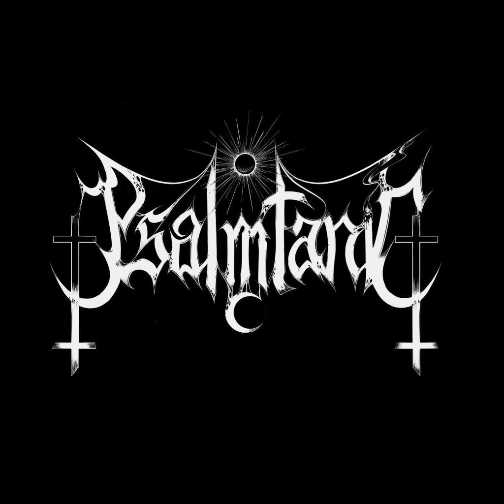
(unknown), S. The Progressive Subway: Interview: Psalmtanic. http://theprogressivesubway.com/2020/04/13/interview-psalmtanic, 2020.
Sample Logos


Illegible Semantics
Introduction
Metal logos can be by turns gaudy, uncouth, or nearly illegible. Yet, these logos work: they communicate sophisticated notions of genre and emotional effect. Now if you’re a metalhead, you already know that. But it has never been investiged scientifically that Metal logos actually tell a story – even if it’s not always immediately apparent. Well, not until now, that is.
Background
We, a group of international researchers and myself, worked on a paper on Metal logo design that was submitted to and accepted by the alt.VIS workshop at IEEE VIS, the premier forum for Visualization and Visual Analytics research.
On Sunday October the 24th of 2021, we presented our work to the Visualization community, and the feedback we have received from its members has been overwhelmingly positive.
Results
What we did, and why did it, is best explained in the paper, but the short of it is that –
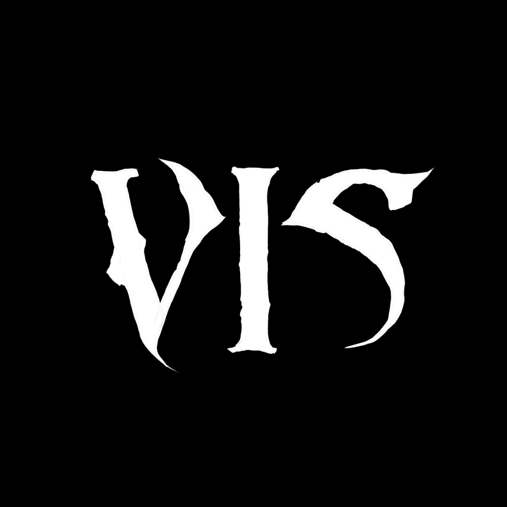
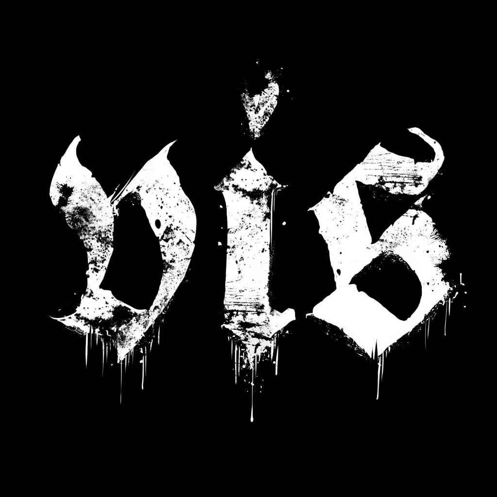
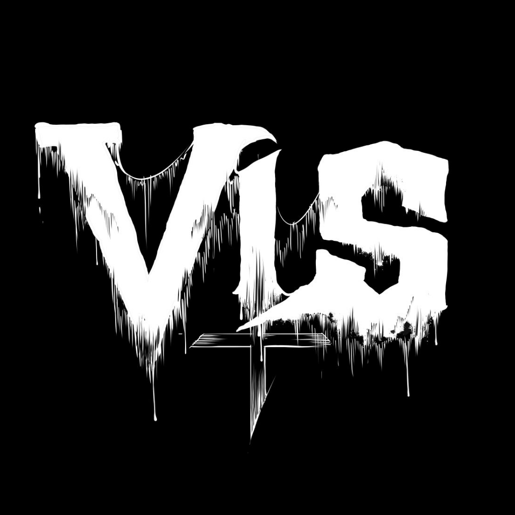
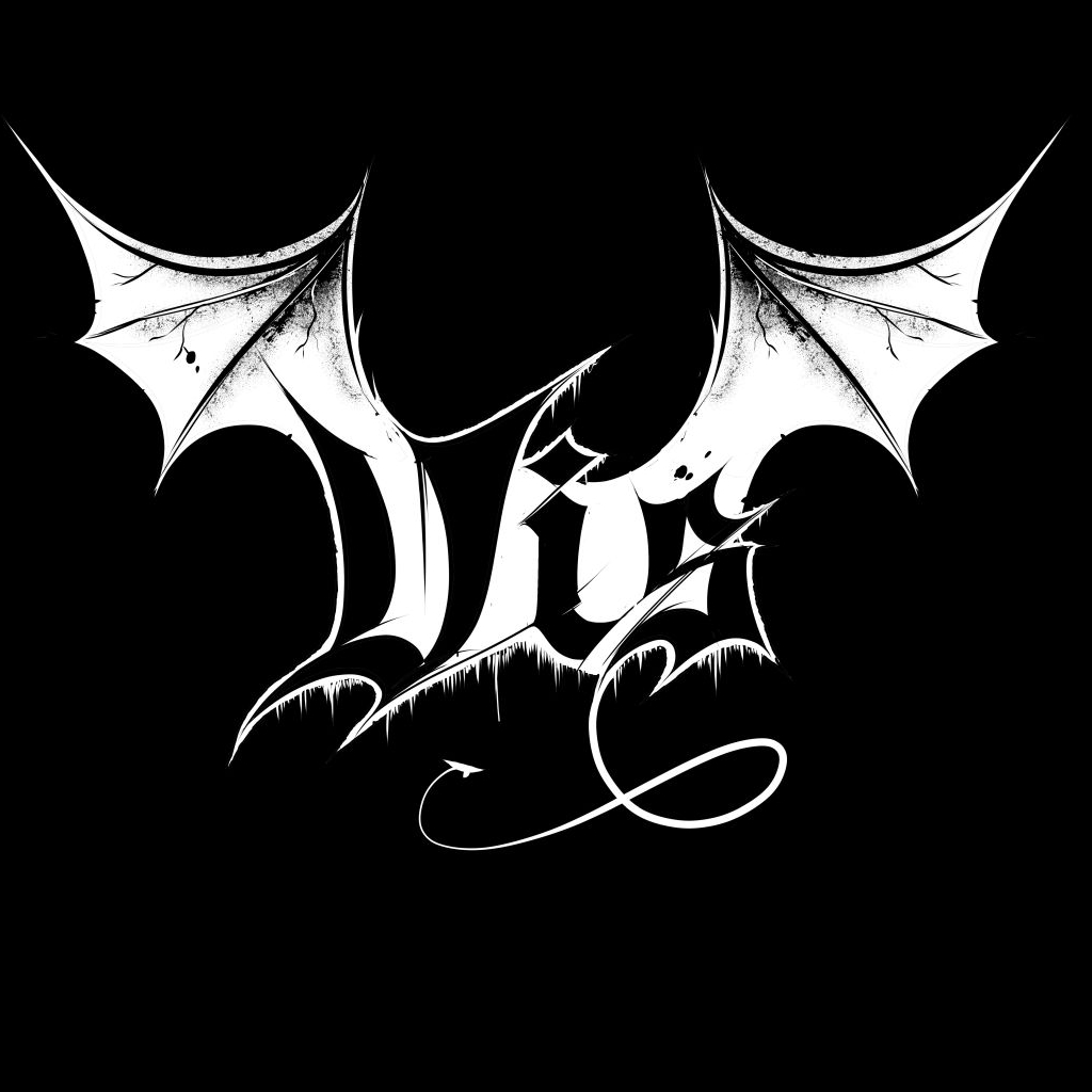
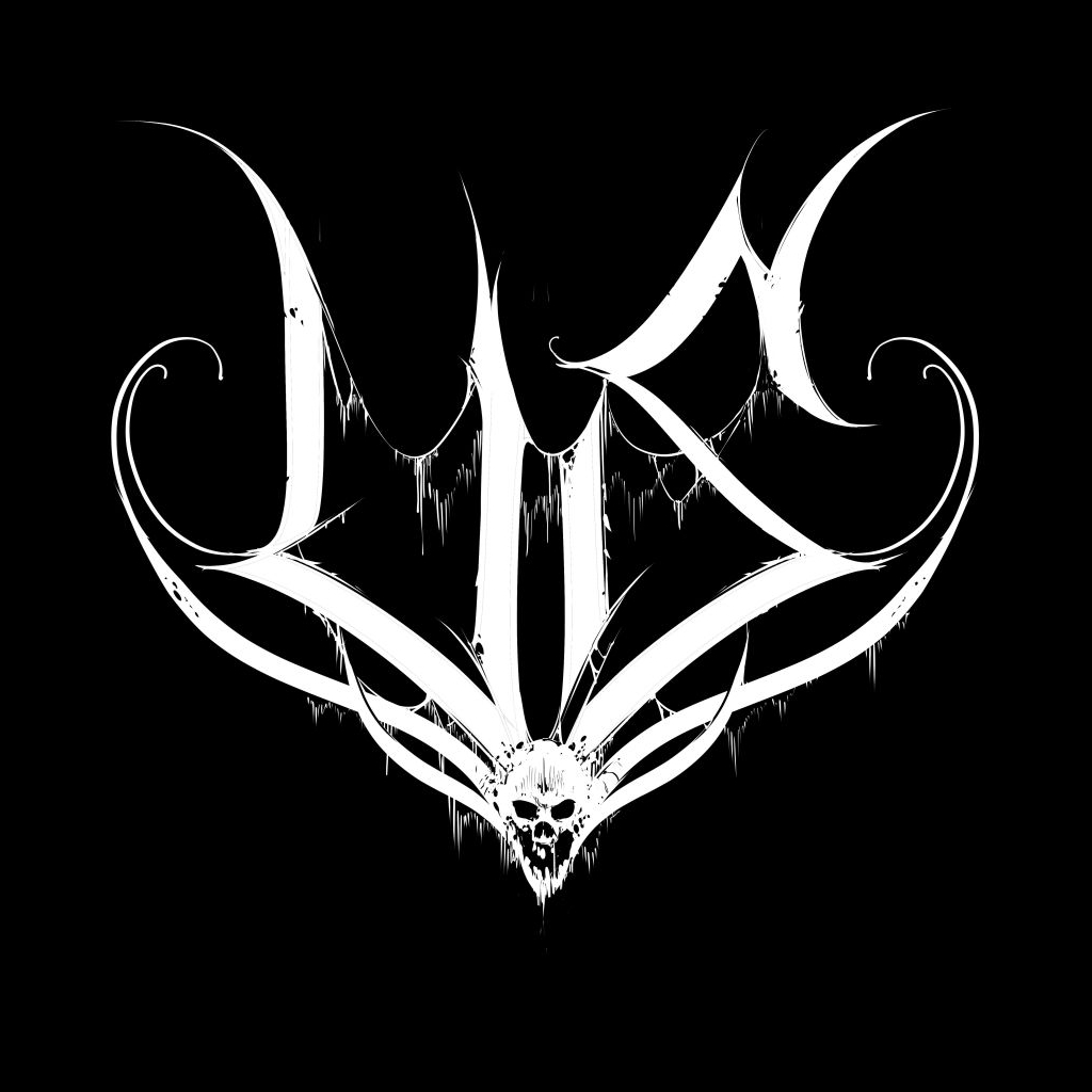
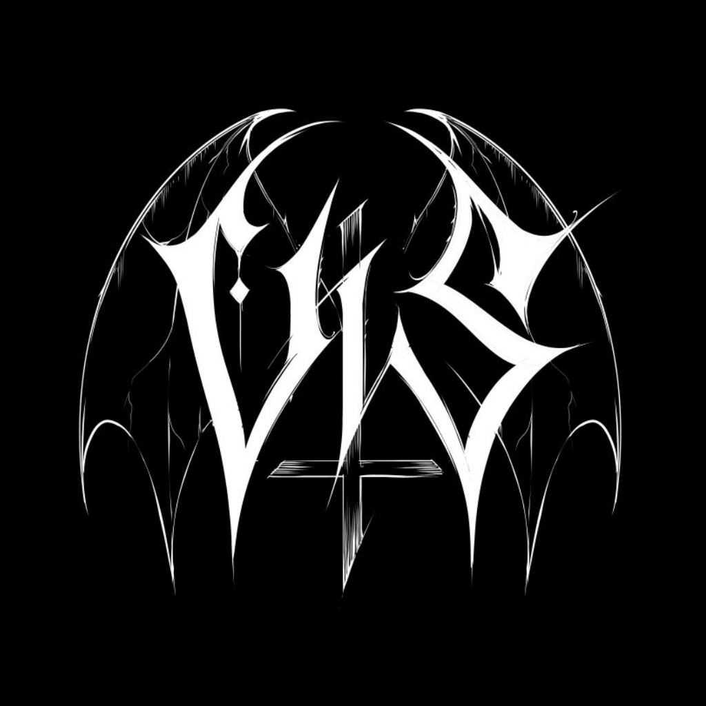
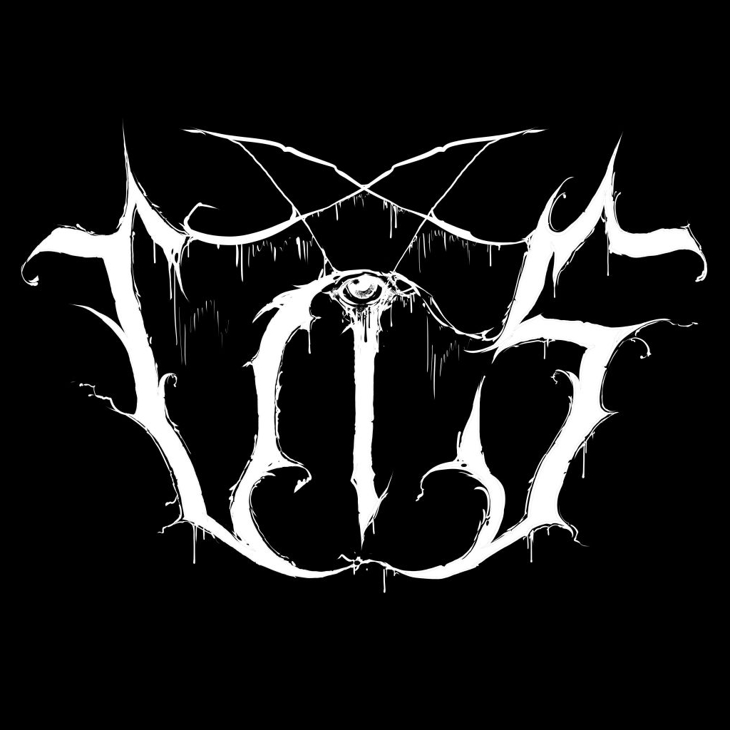
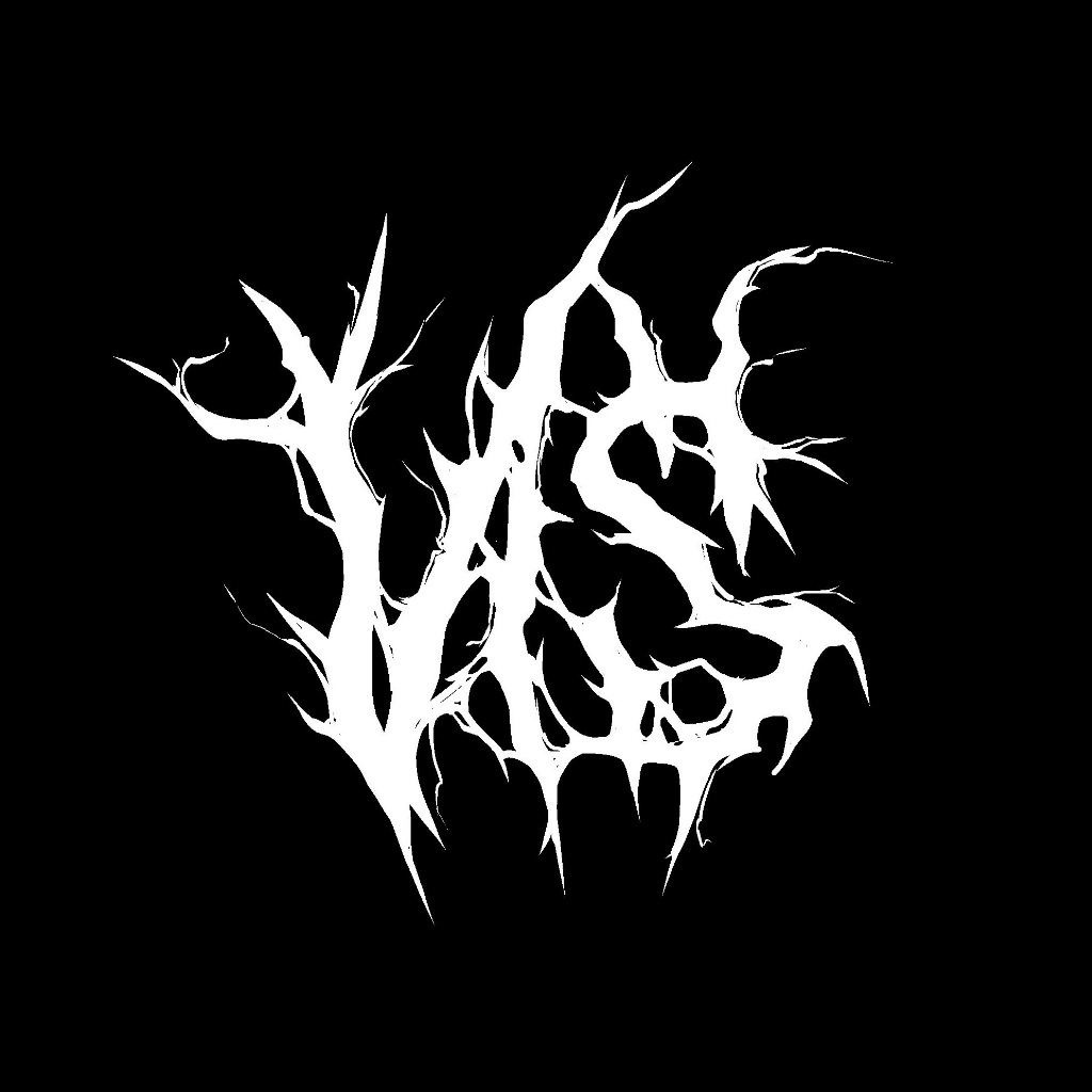
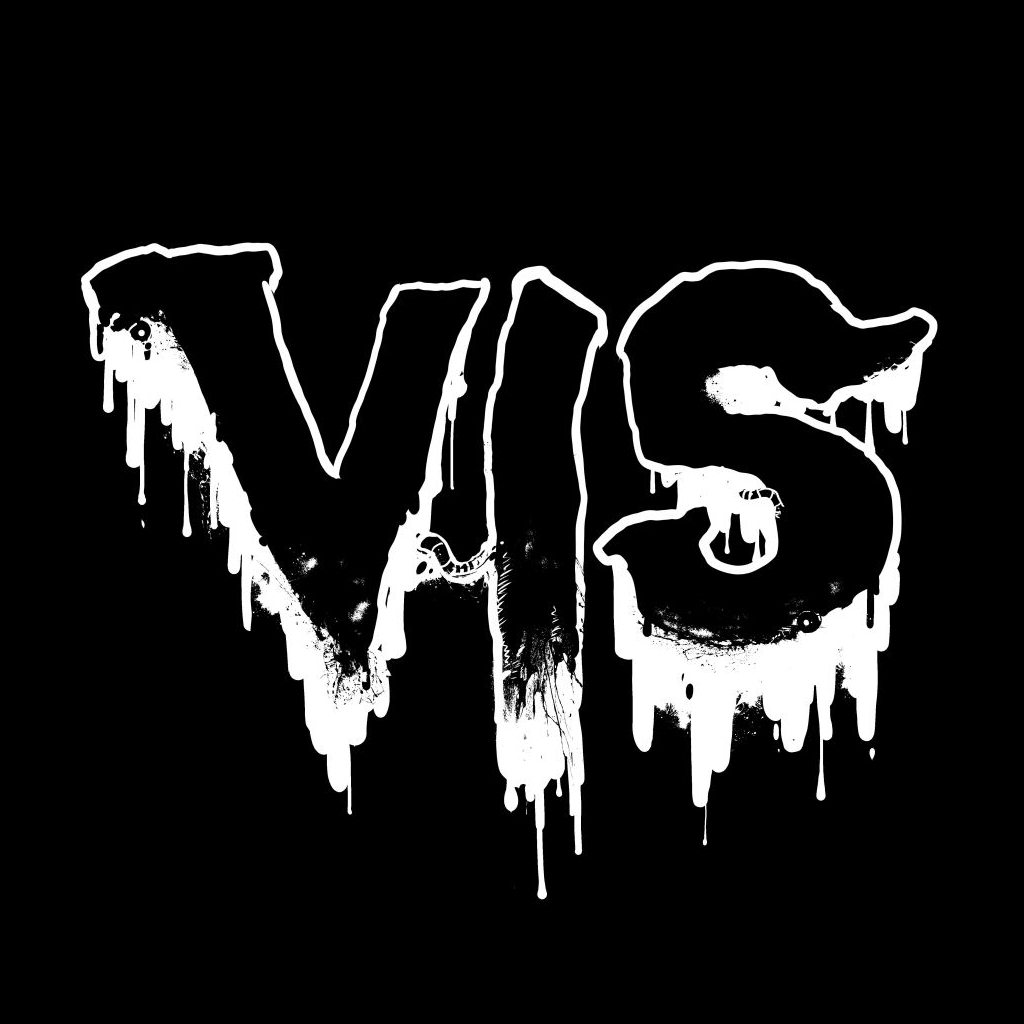
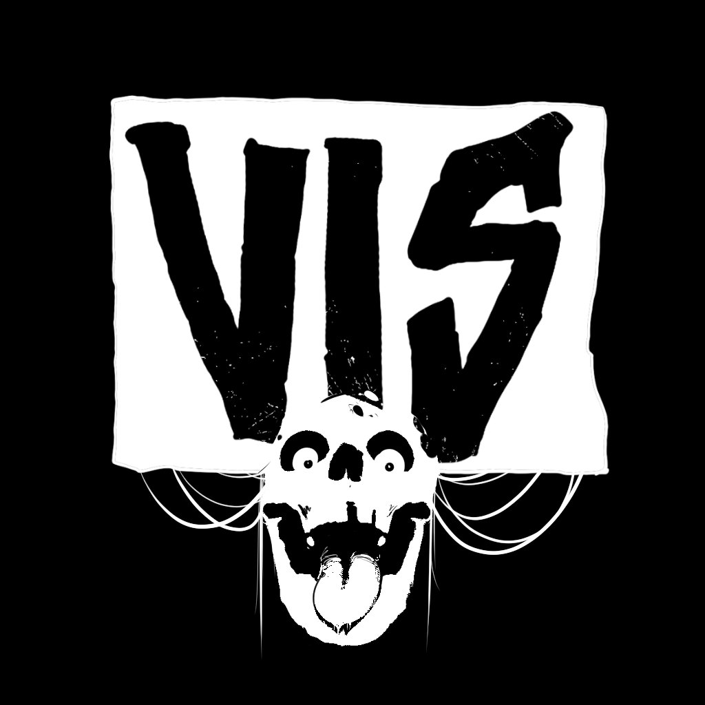
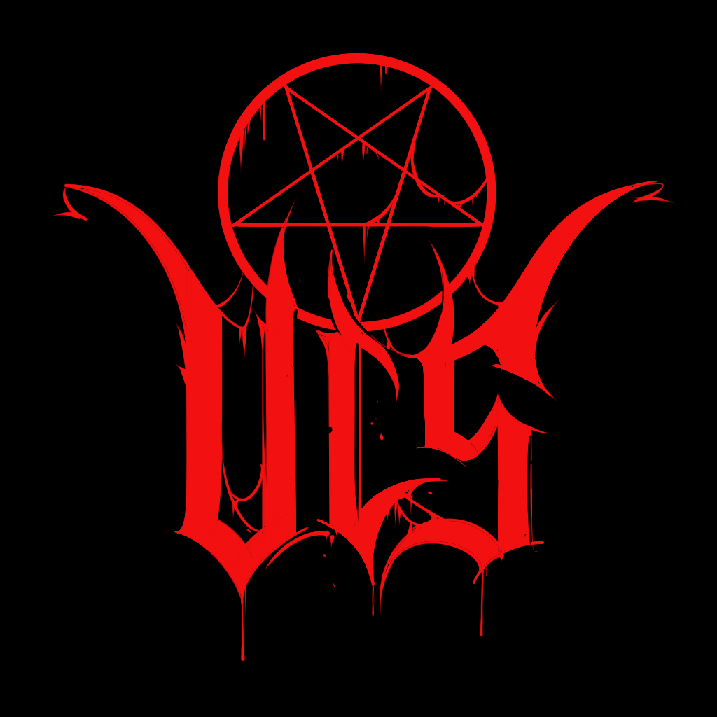
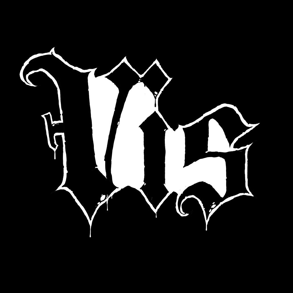
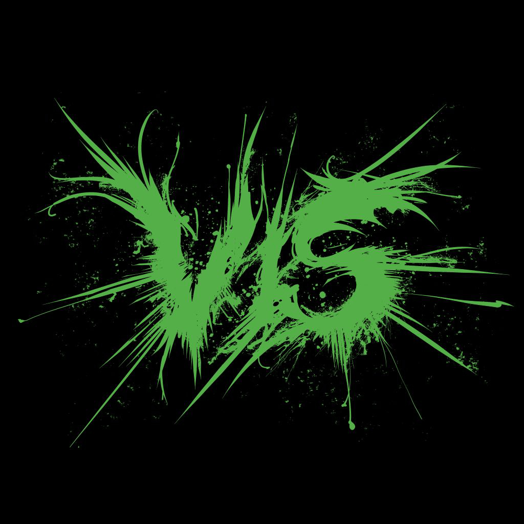
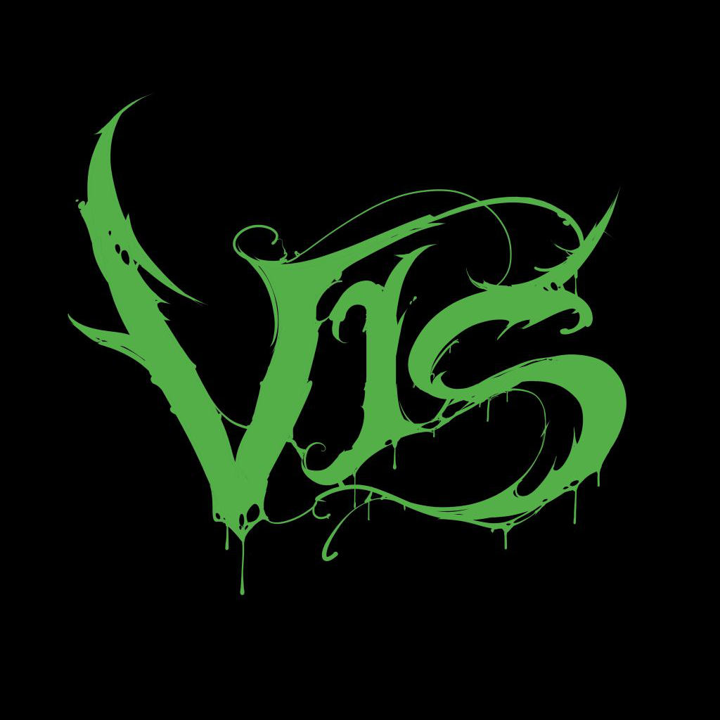
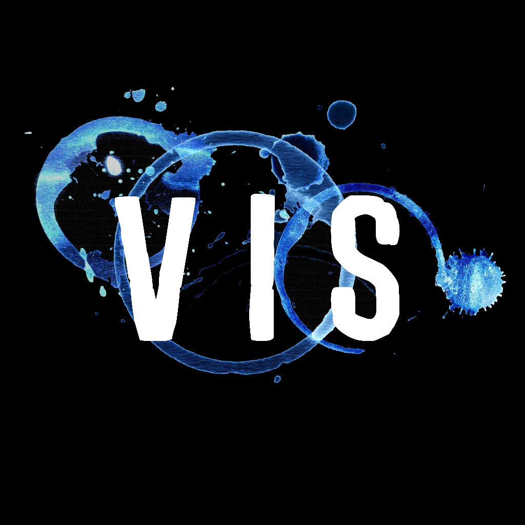
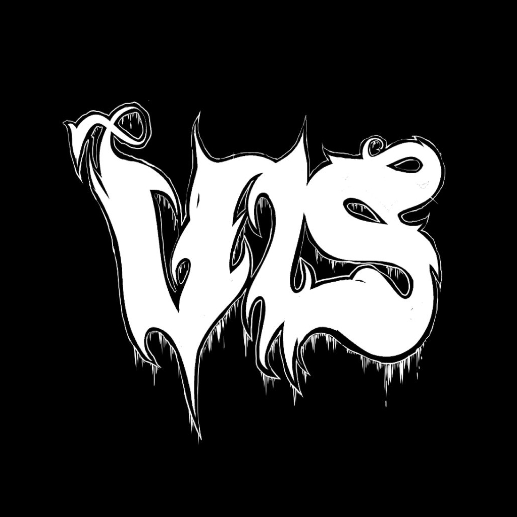
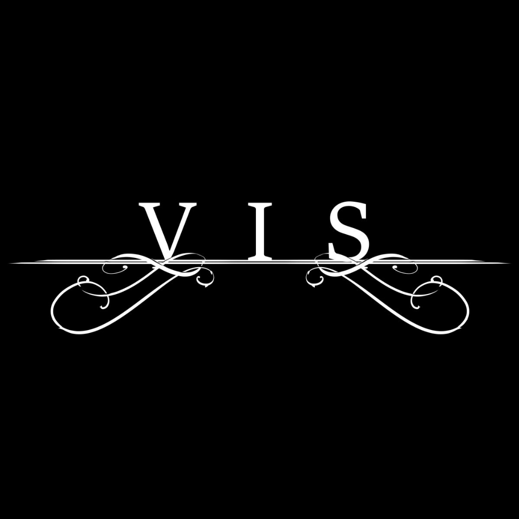
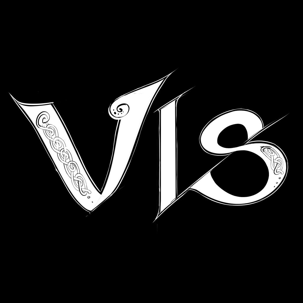
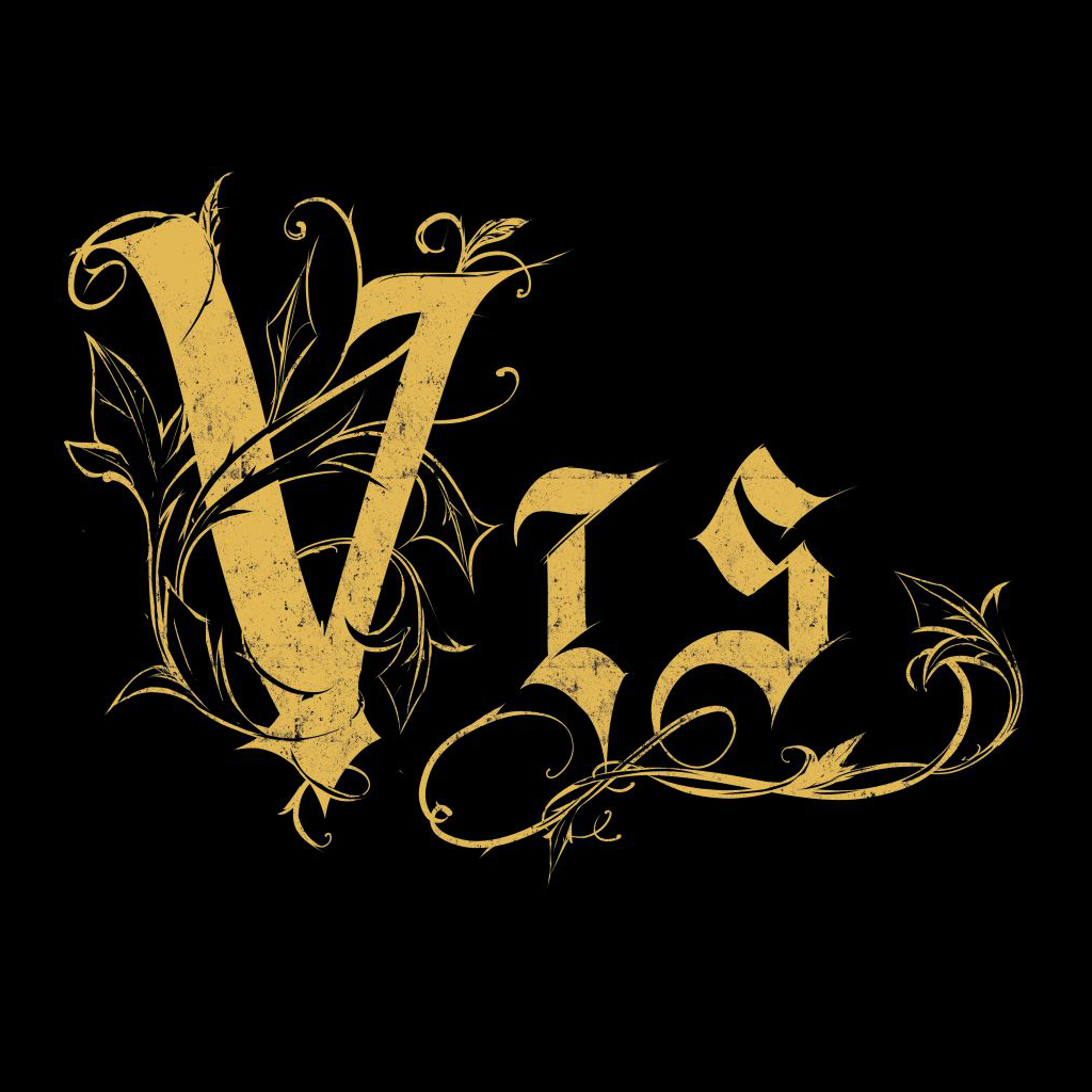
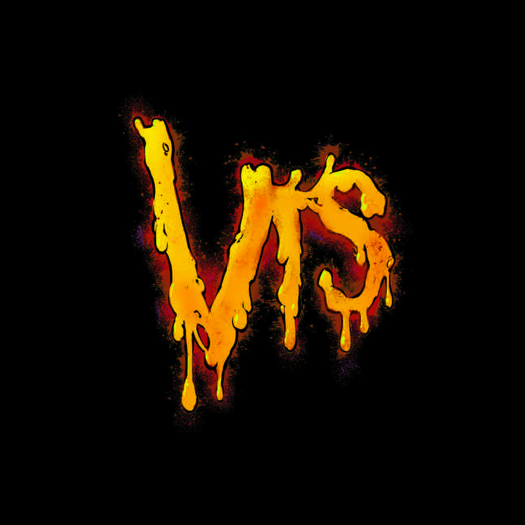
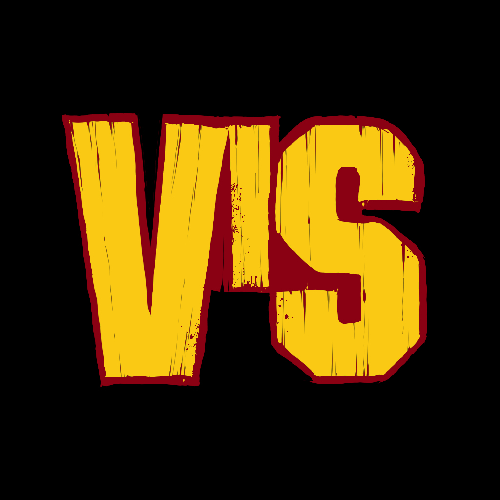
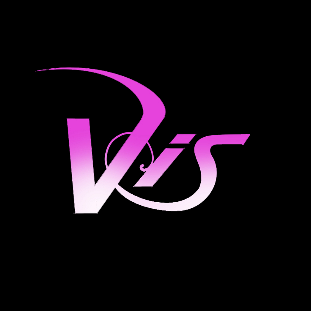
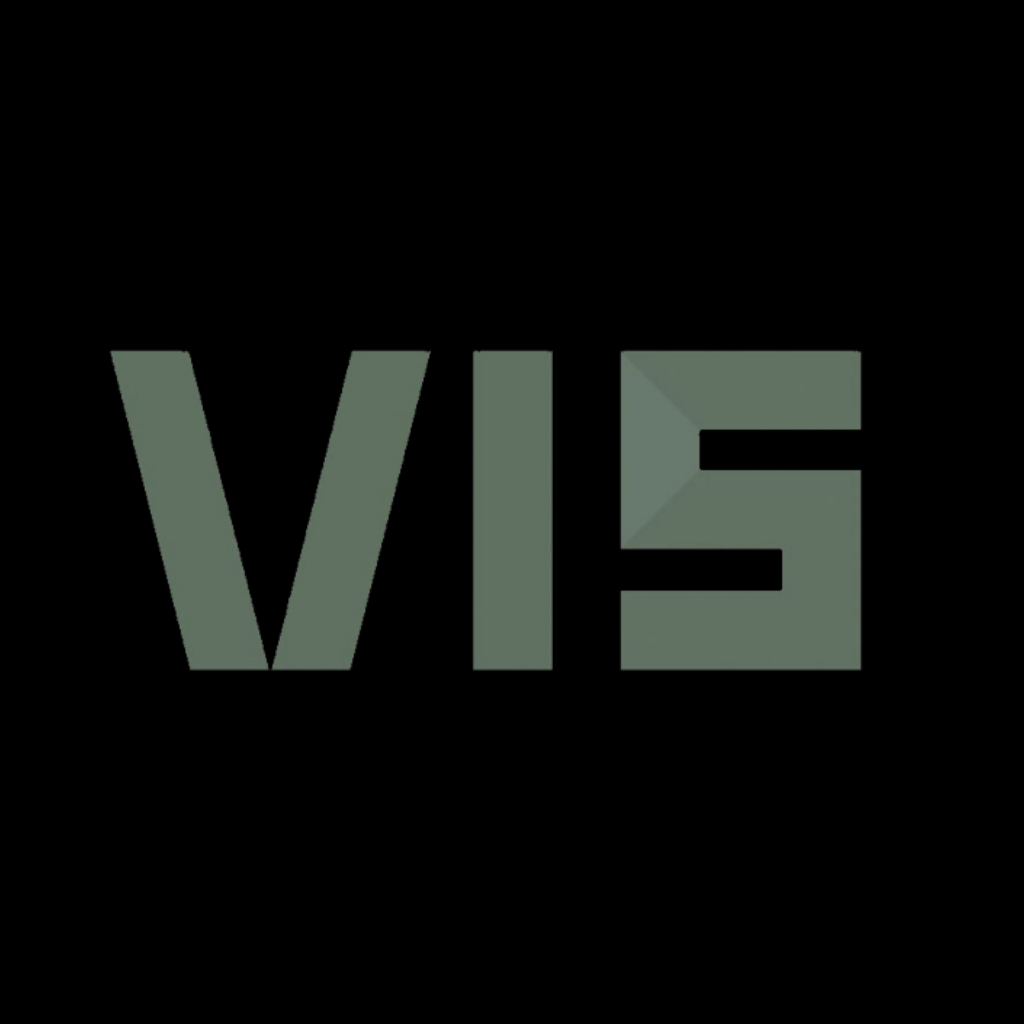
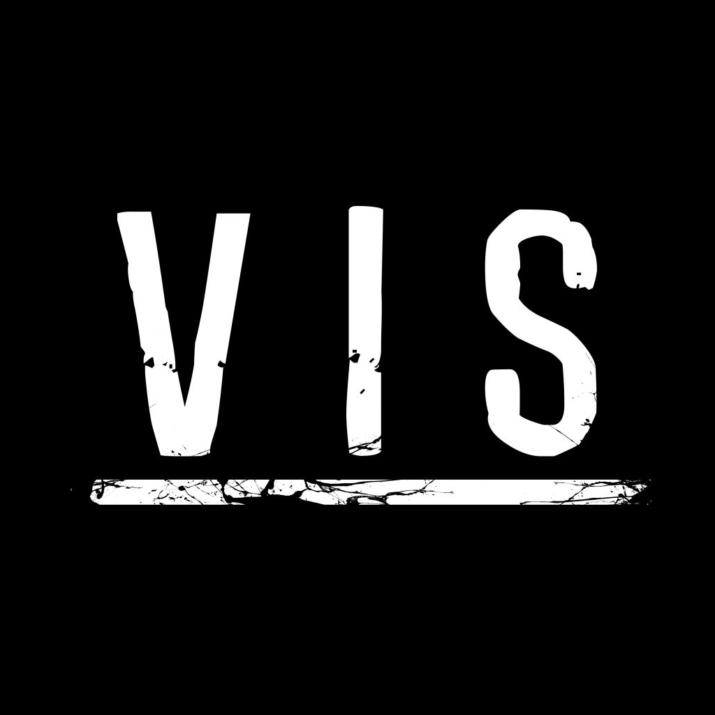
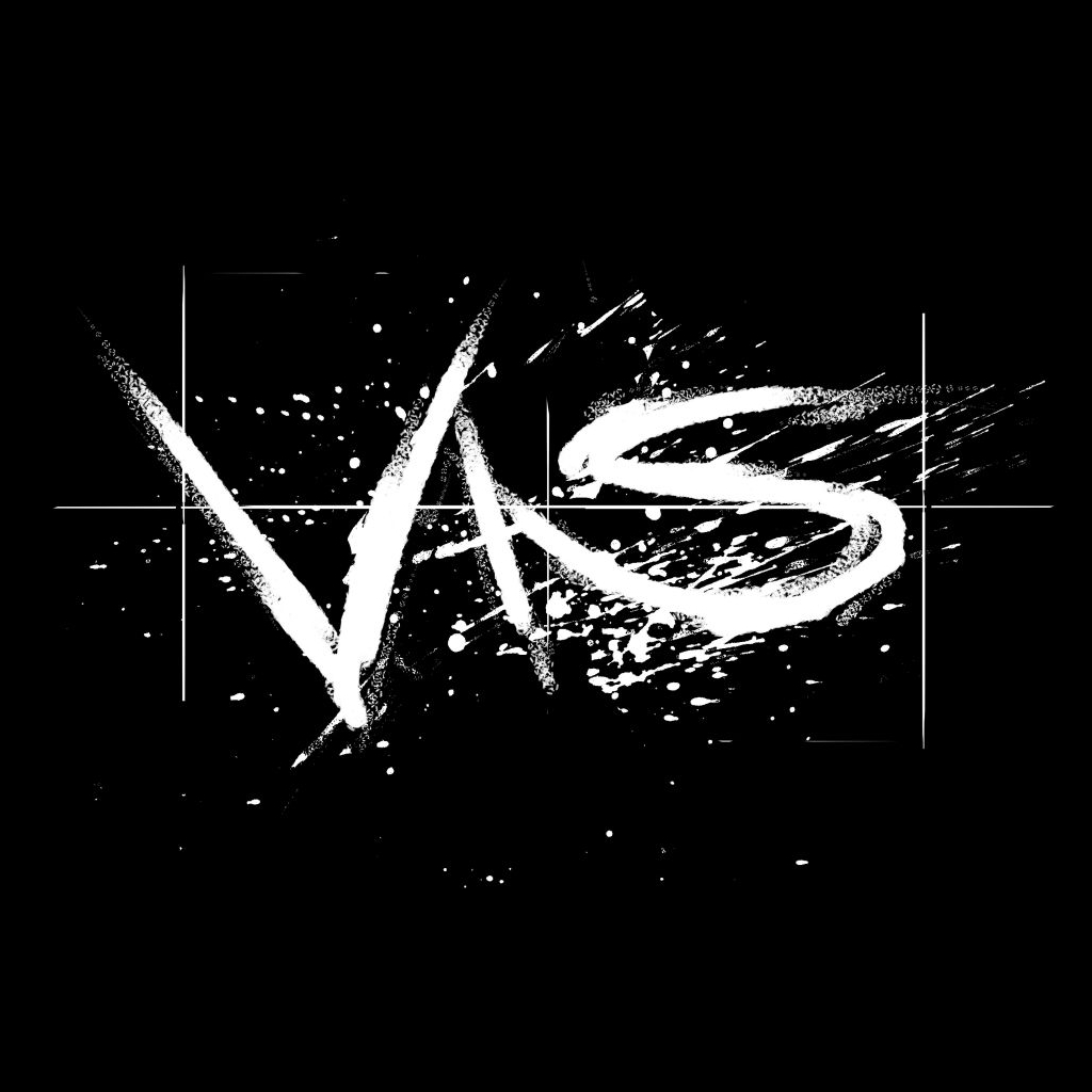
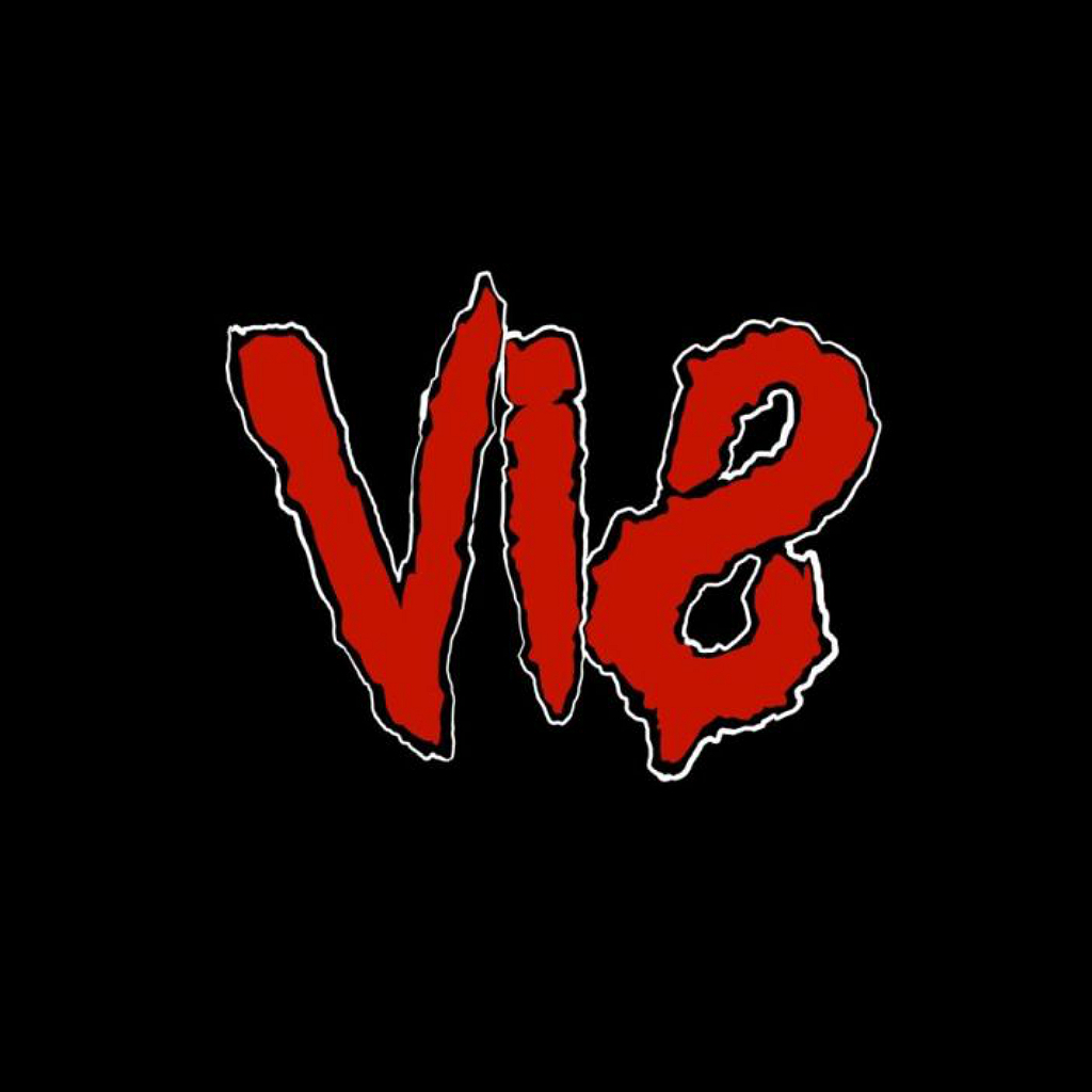
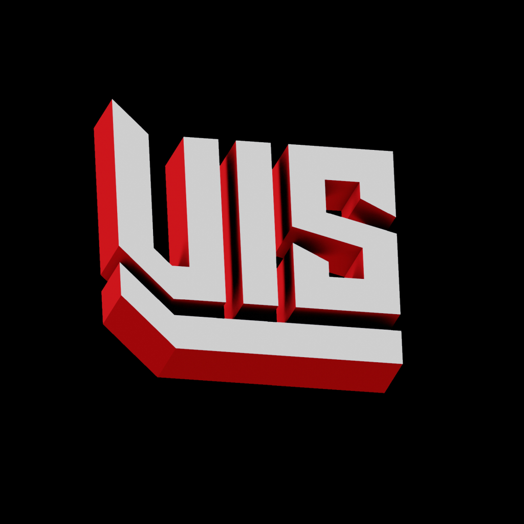
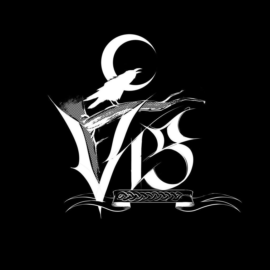
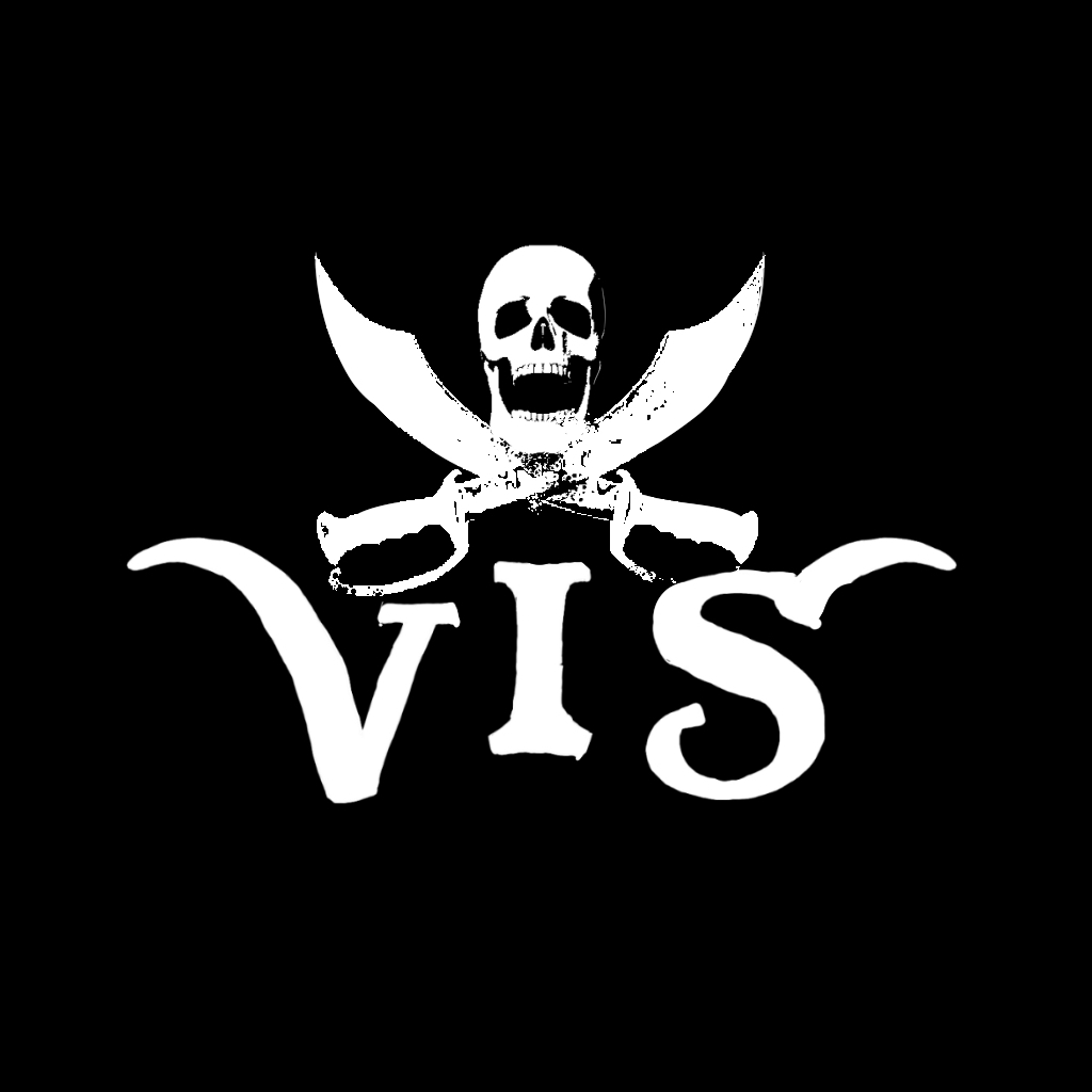
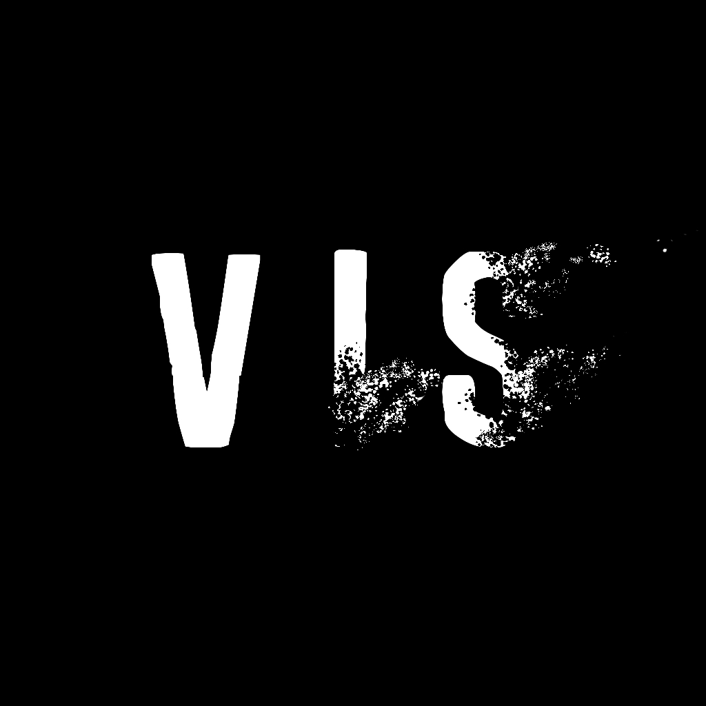
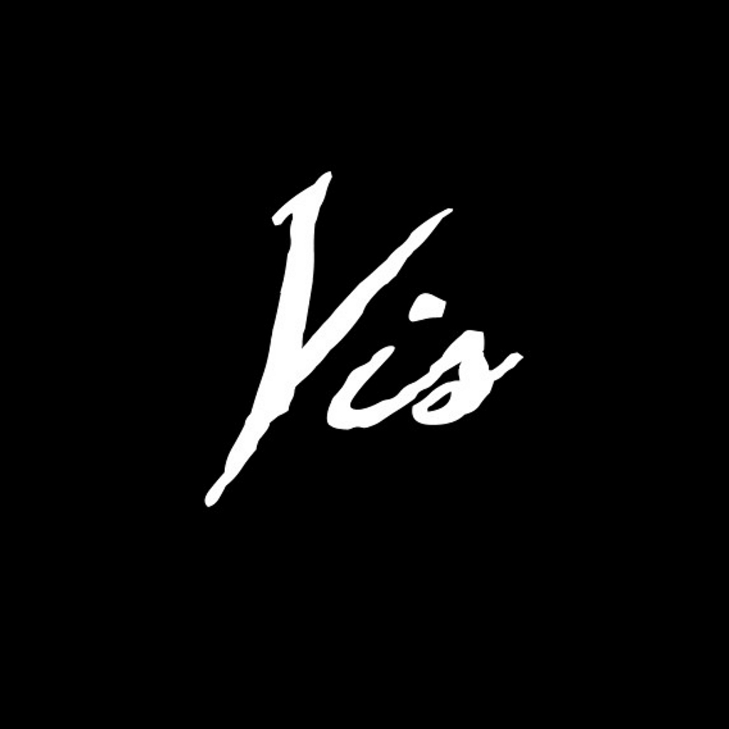
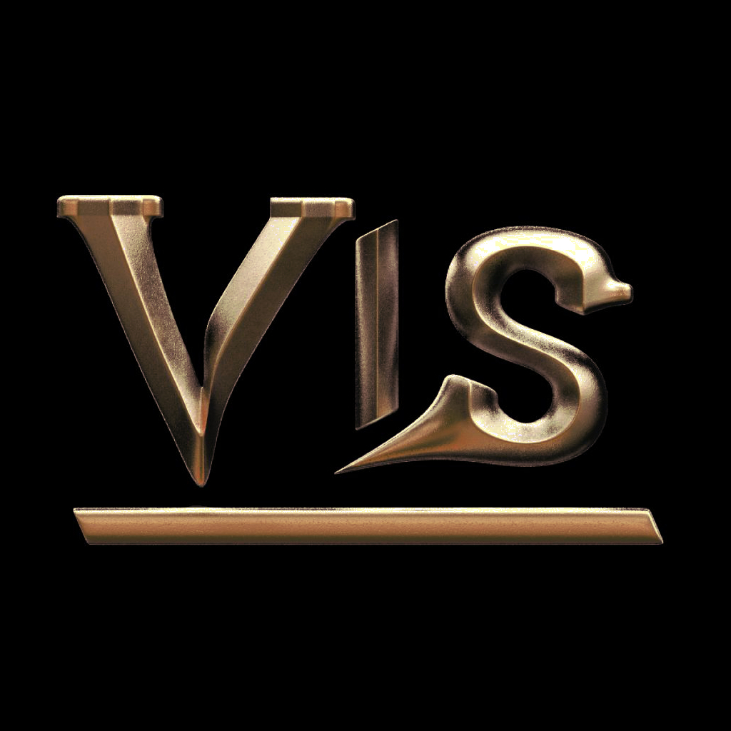
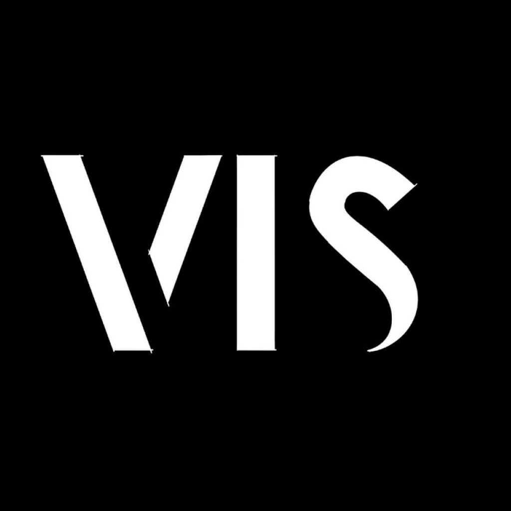
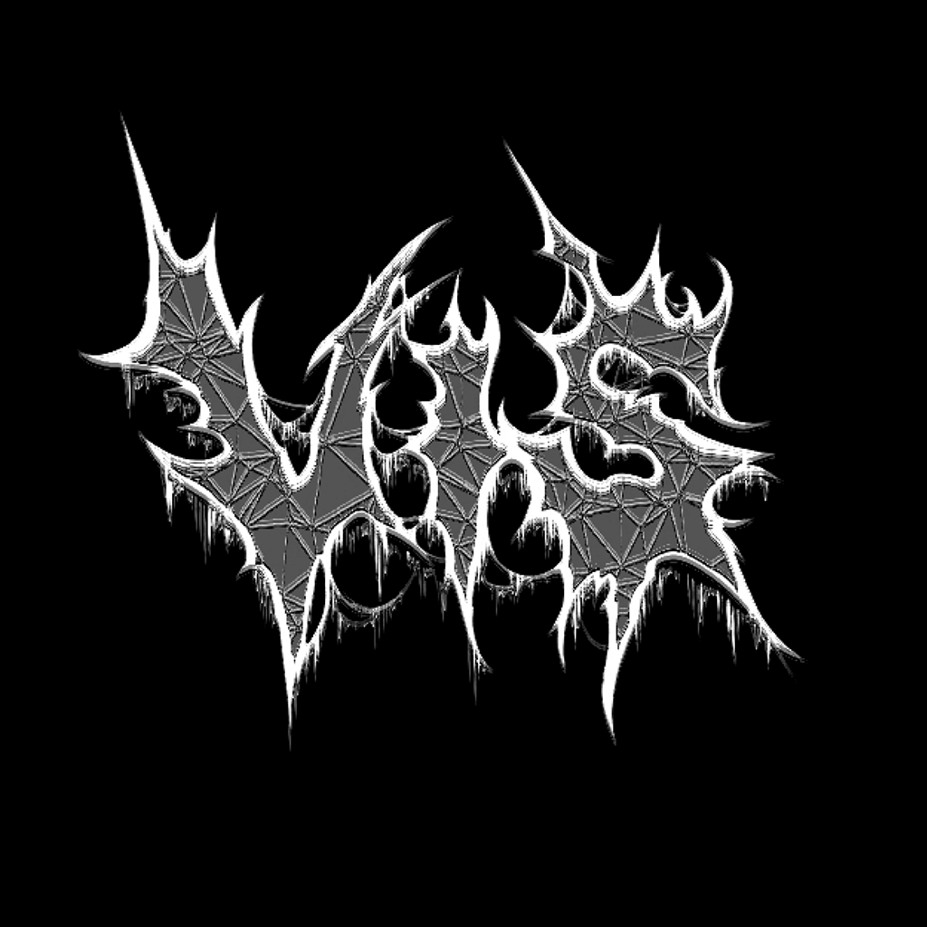
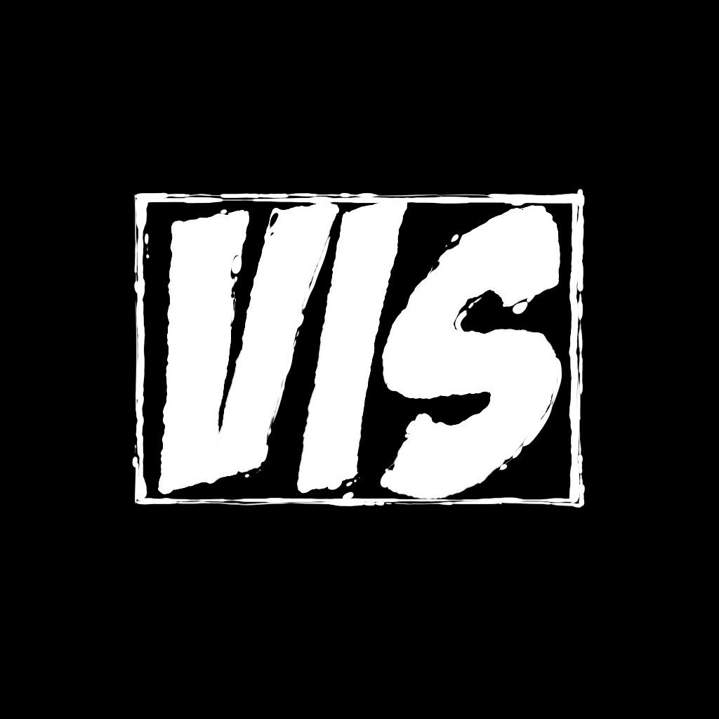
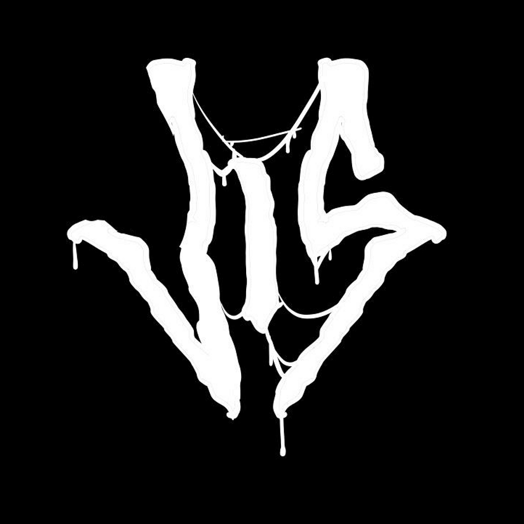
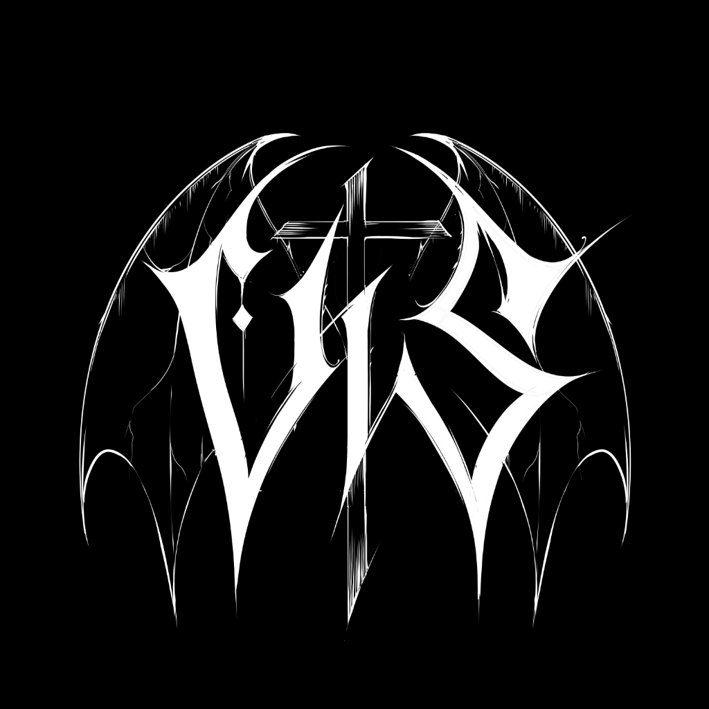
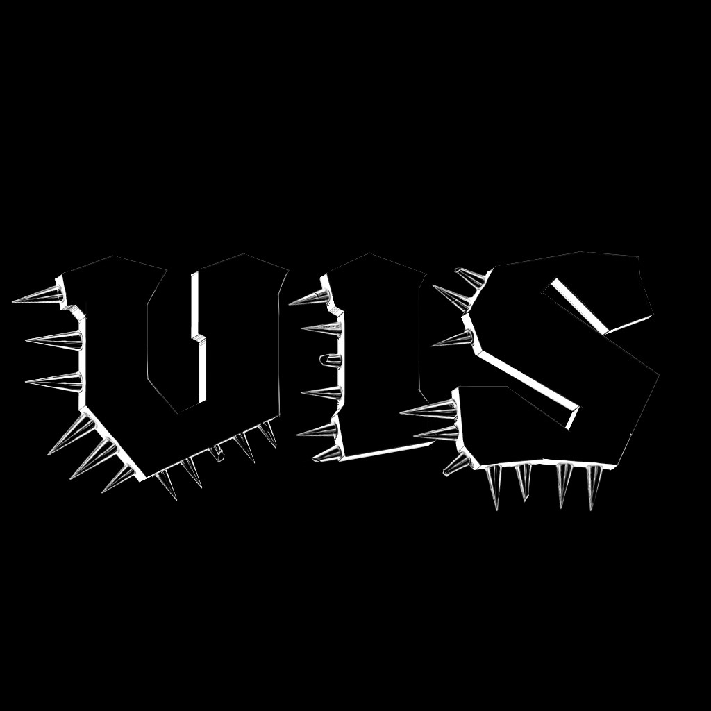
- we worked on a framework, which we dubbed the “Dimensions of Doom,” to help characterize “illegible” band logos. To test and further develop this, I created almost 50 logos of the same word (VIS) in various genre-representative styles.
- we developed a web tool that is based on machine learning that (1) allows the user to explore a “cloud” of thousands of existing band logos that were scraped from Encyclopaedia Metallum and (2) group them based on certain characteristics such as genre, color, and “image-likenes.”
The main result of the paper is that we can now say that there is definitely more to designing Metal logos than just making them as unreadable as possible; that there is indeed a visual language in the logos, which may have implications for visualization research topics.
But don’t believe us; see for yourself! The paper’s available open access; you download a PDF version here.
Its website companion, which contains a link to the MetalVis web tool and a tutorial on how to use it, can be can be found here.
What’s Next?
In the future, we plan to continue working to both extend, refine, and unify our parallel approaches. Doing this should help us get a better understanding of how visual style creates meaning in band logos.
To this end, additional interactive features and filter options will be added to the web tool (such as geography or our Dimensions of Doom). The Dimensions of Doom, too, are a work in progress and not a gospel that can’t be changed. In fact, we already have some ideas for future changes and improvements.
Conclusion
We see a potential that reaches beyond logo design and the Metal industry at large. Further work may indeed well lead to an expanding knowledge of visual rhetoric and its history.
Based on our preliminary study, we may already cautiously suggest that literal legibility – that is legibility understood in terms of clarity and efficiency – is not the be-all-end-all of textual information visualization, contrary to what common wisdom says on the matter.