 ← Home
The science of logos · A field guide
The Genre Guide
Fifty-one ways to spell VIS
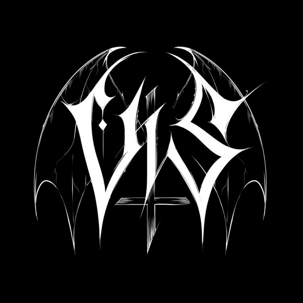
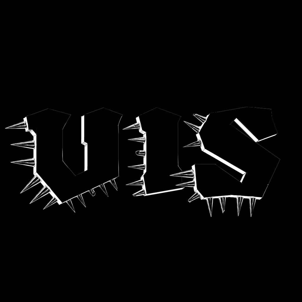
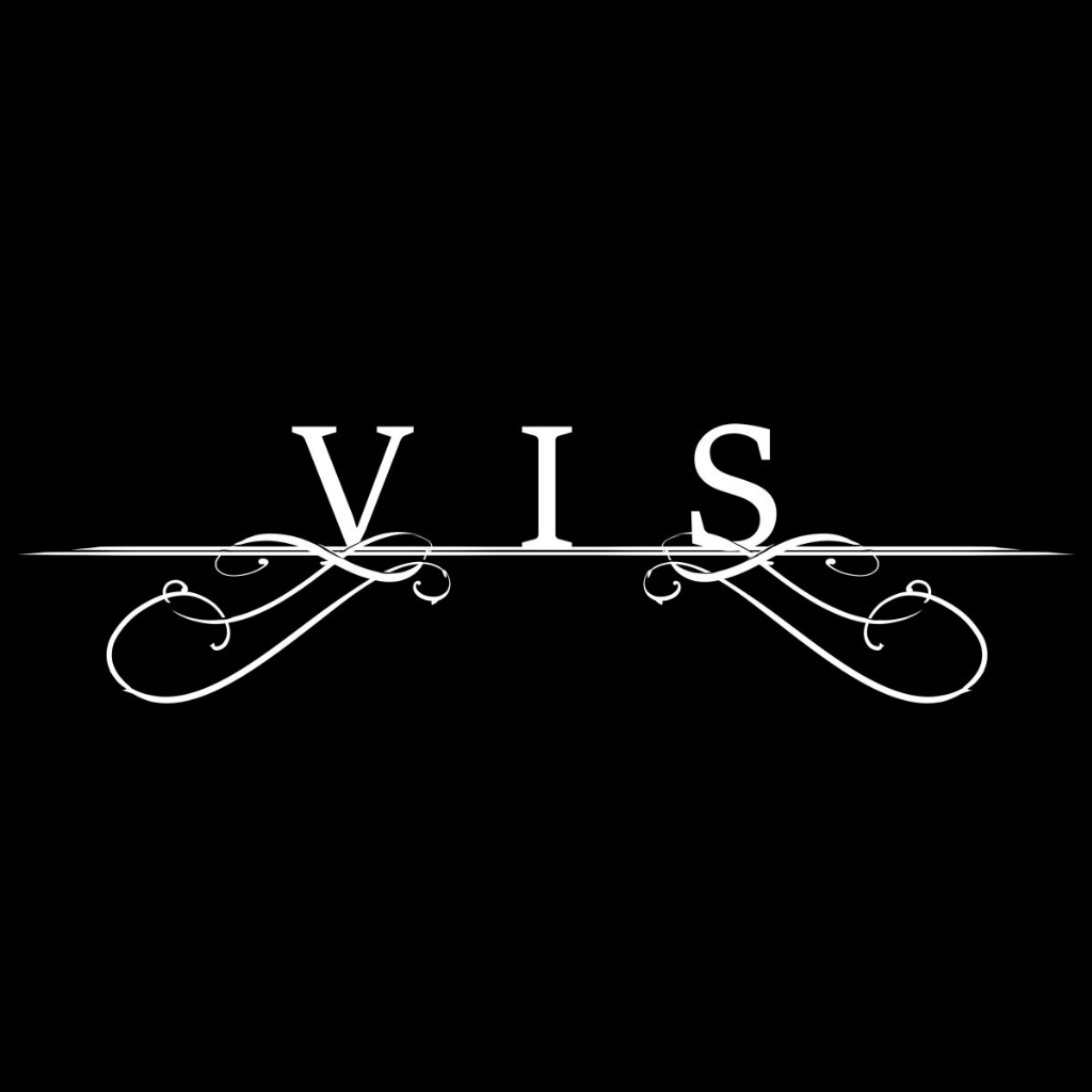
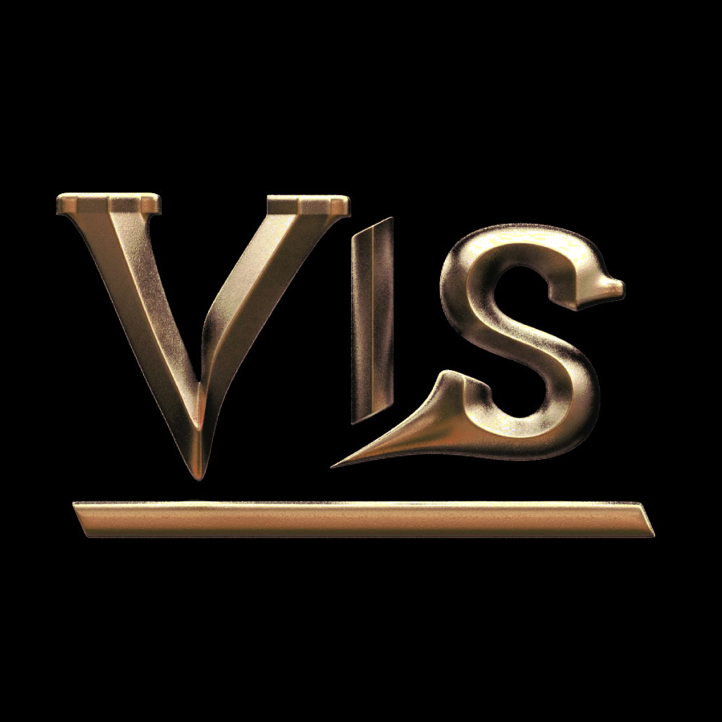
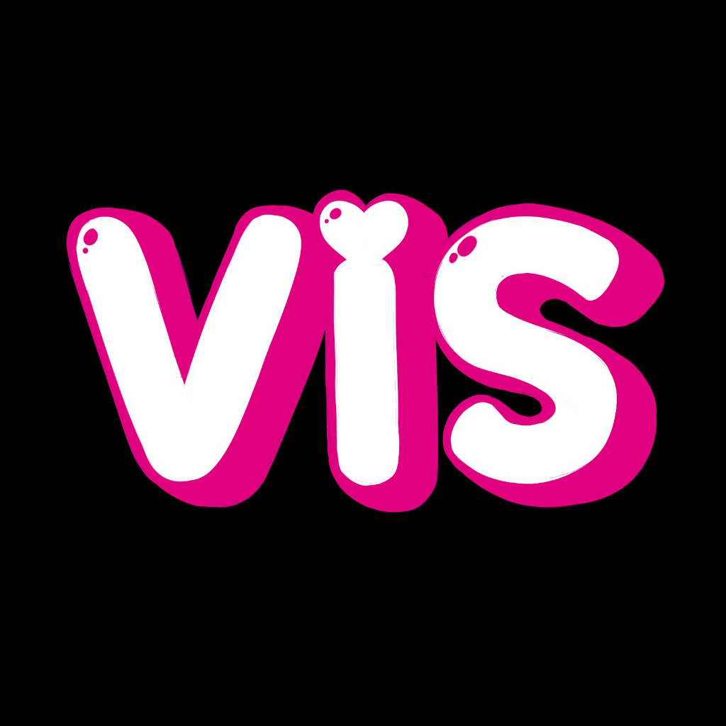
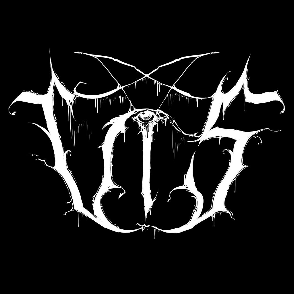
Every genre of Metal has its own rules and aesthetics, and it gets weirdly specific: subgenre, microgenre, even a band's hometown can change what its logo looks like. To make sense of it all, I drew the same name, VIS, in 51 genre styles, had them vetted by scene veterans, and added some humorous, tongue-in-cheek commentary on how each one is made.
The specimens
Pick your poison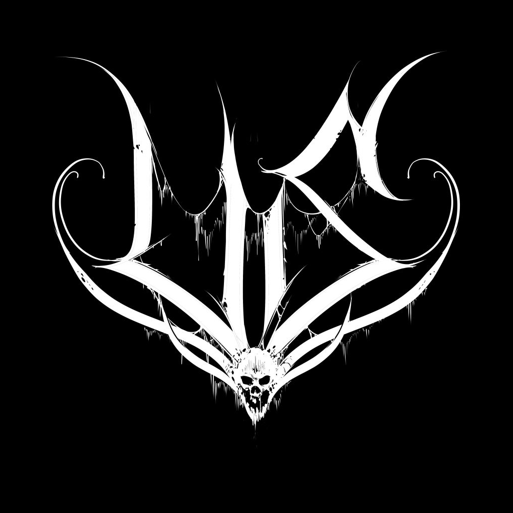
- †high degree of symmetry
- †blackletter(-like) form
- †curls and spikes
- †high degree of symmetry
- †blackletter(-like) form
- †exaggerated edges
- †high degree of symmetry
- †flourishes: curls and spikes
- †exaggerated edges
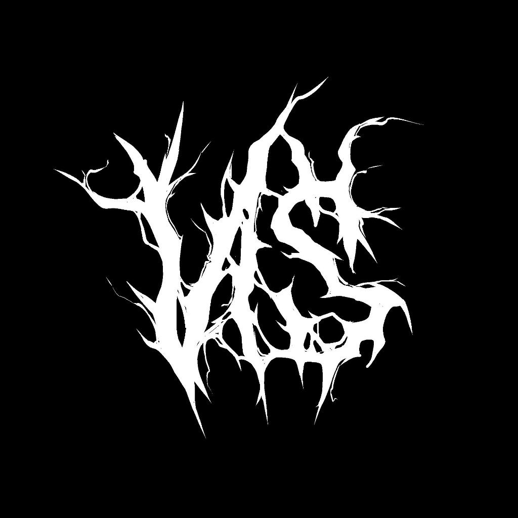
- †blackletter(-like) form
- †flourishes: curls and spikes
- †exaggerated edges
- †black negative-space letters
- †white keyline detail
- †bullet-cartridge spikes
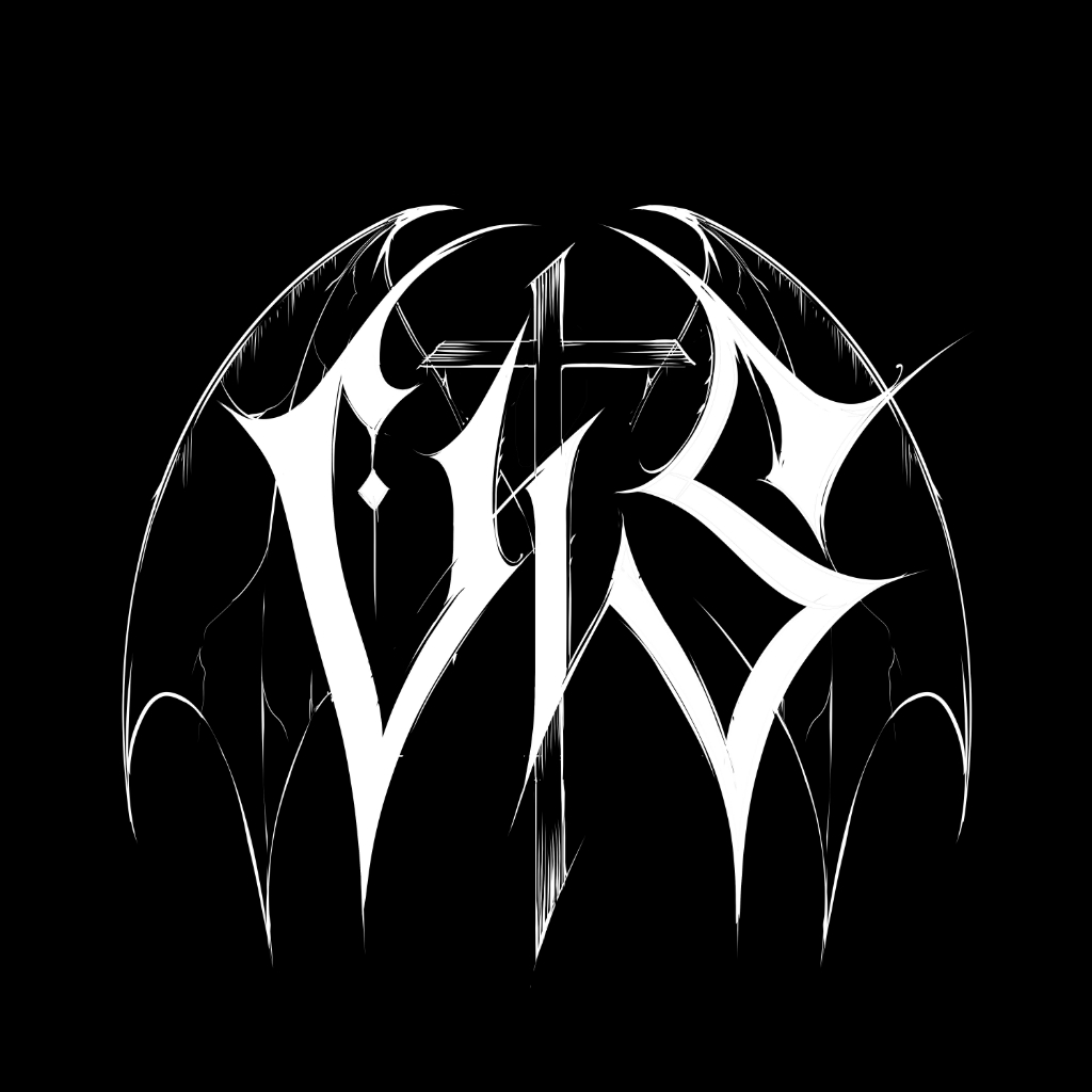
- †your average Black Metal logo
- †upright crosses, never inverted
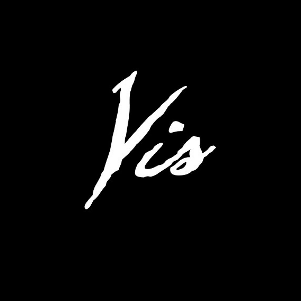
- †Gothic hand-writing
- †Sleepy Hollow energy
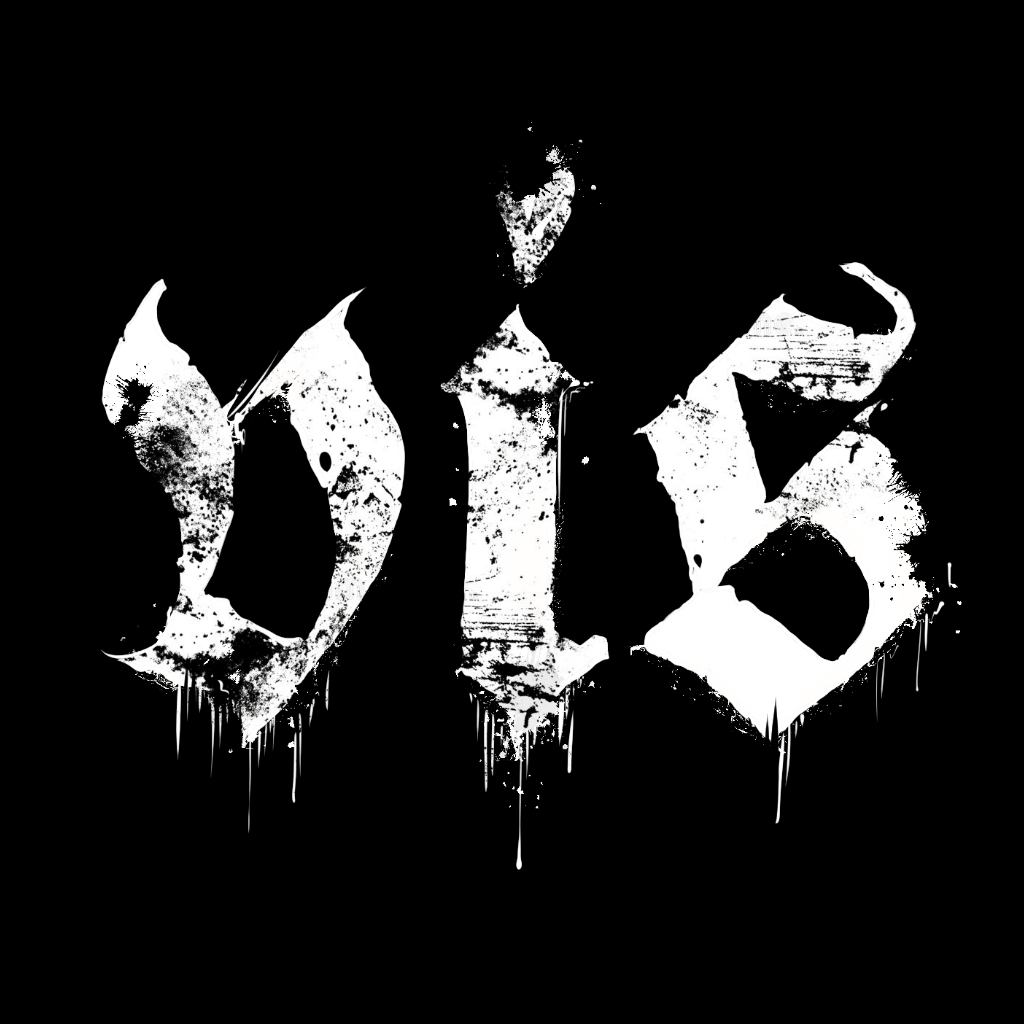
- †a dirty look
- †Fraktur or Gothic-script wordmark
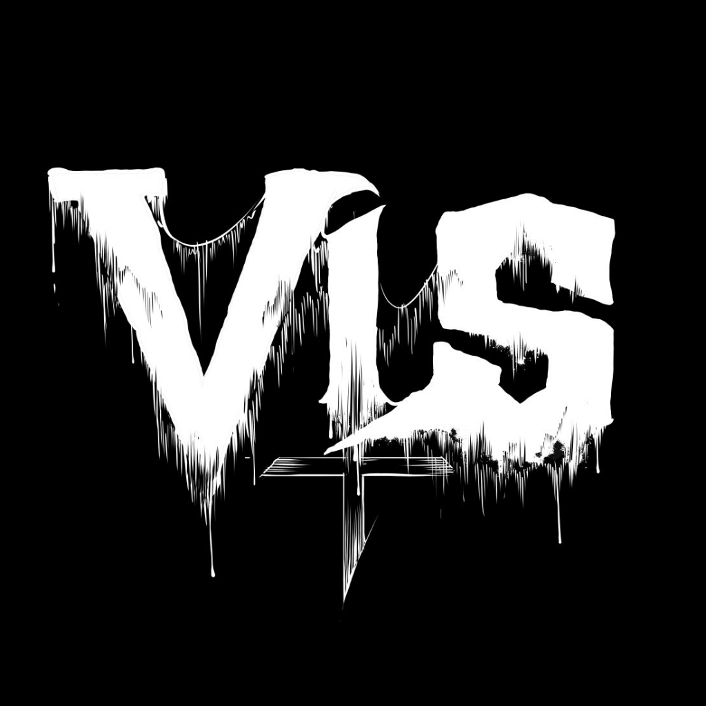
- †run-of-the-mill Death letters
- †inverted cross, pentagram or horns
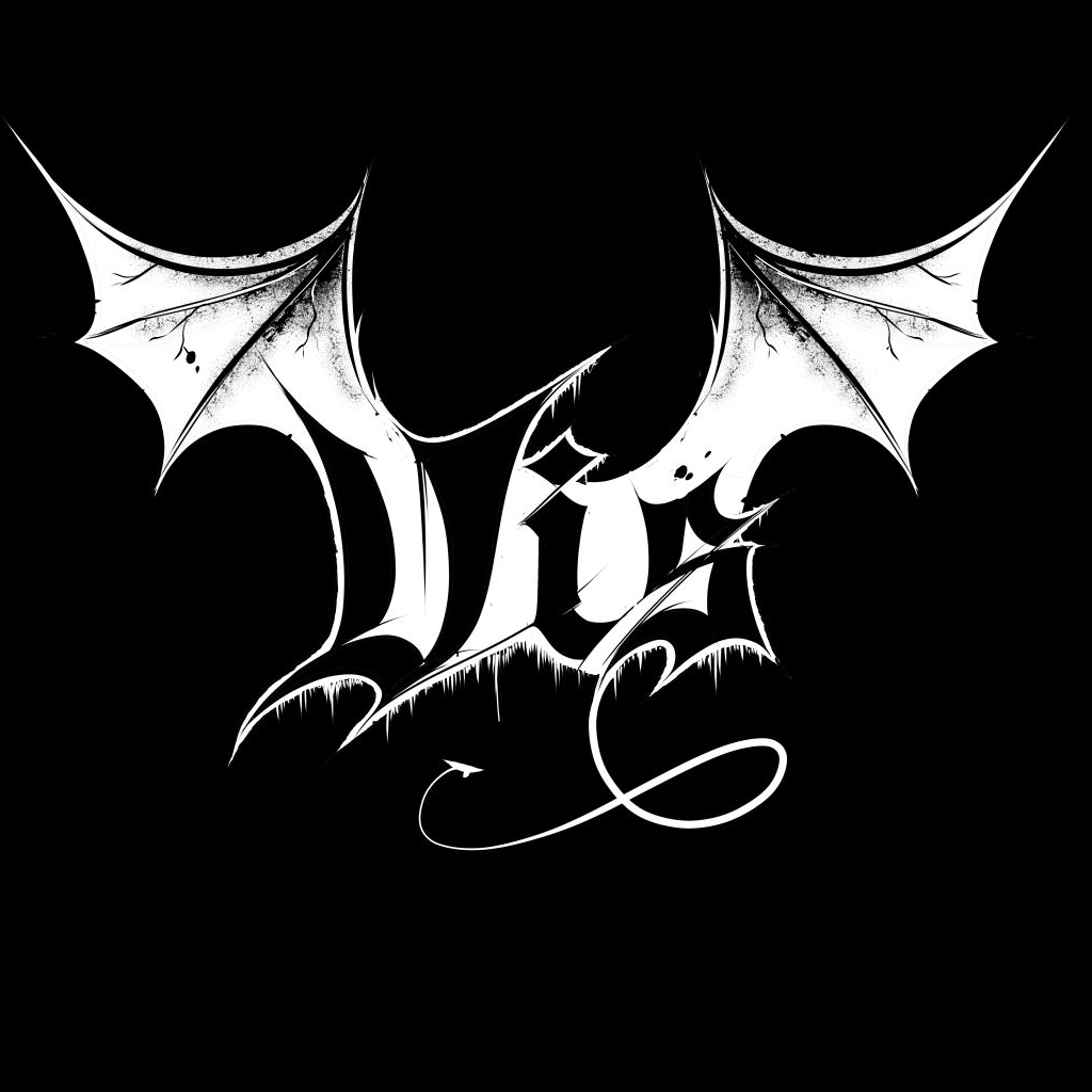
- †Death-Doom-like letters
- †bat wings
- †a pentagram
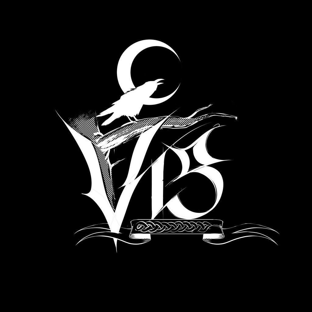
- †high on-the-noseness
- †figurative, romantic graphics
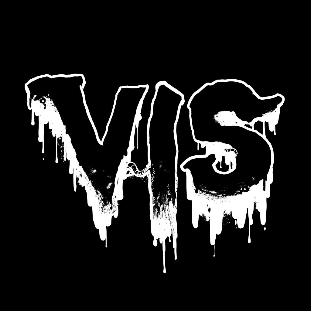
- †gore elements
- †bones dripping blood
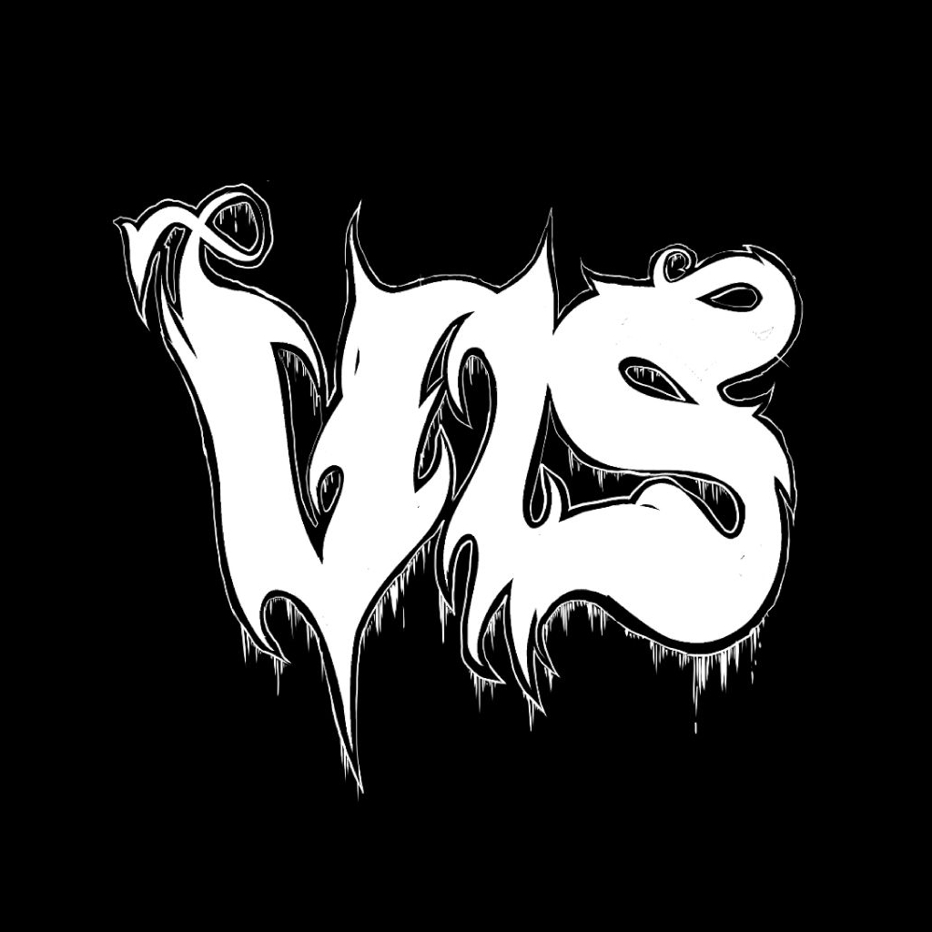
- †thick, bold letters
- †soft elements
- †a hellfire, tattoo-like feel
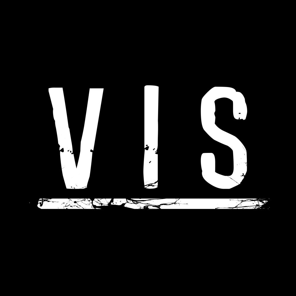
- †highly readable wordmark
- †dirtied up, sometimes
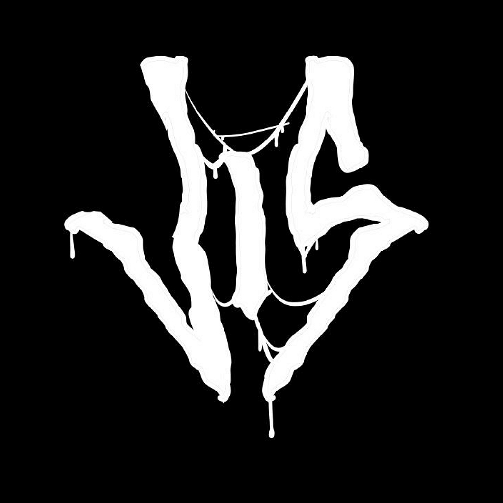
- †looks like a Black Metal logo
- †not nearly as sophisticated

- †Illustrator Pen-tool letters
- †a Bézier look
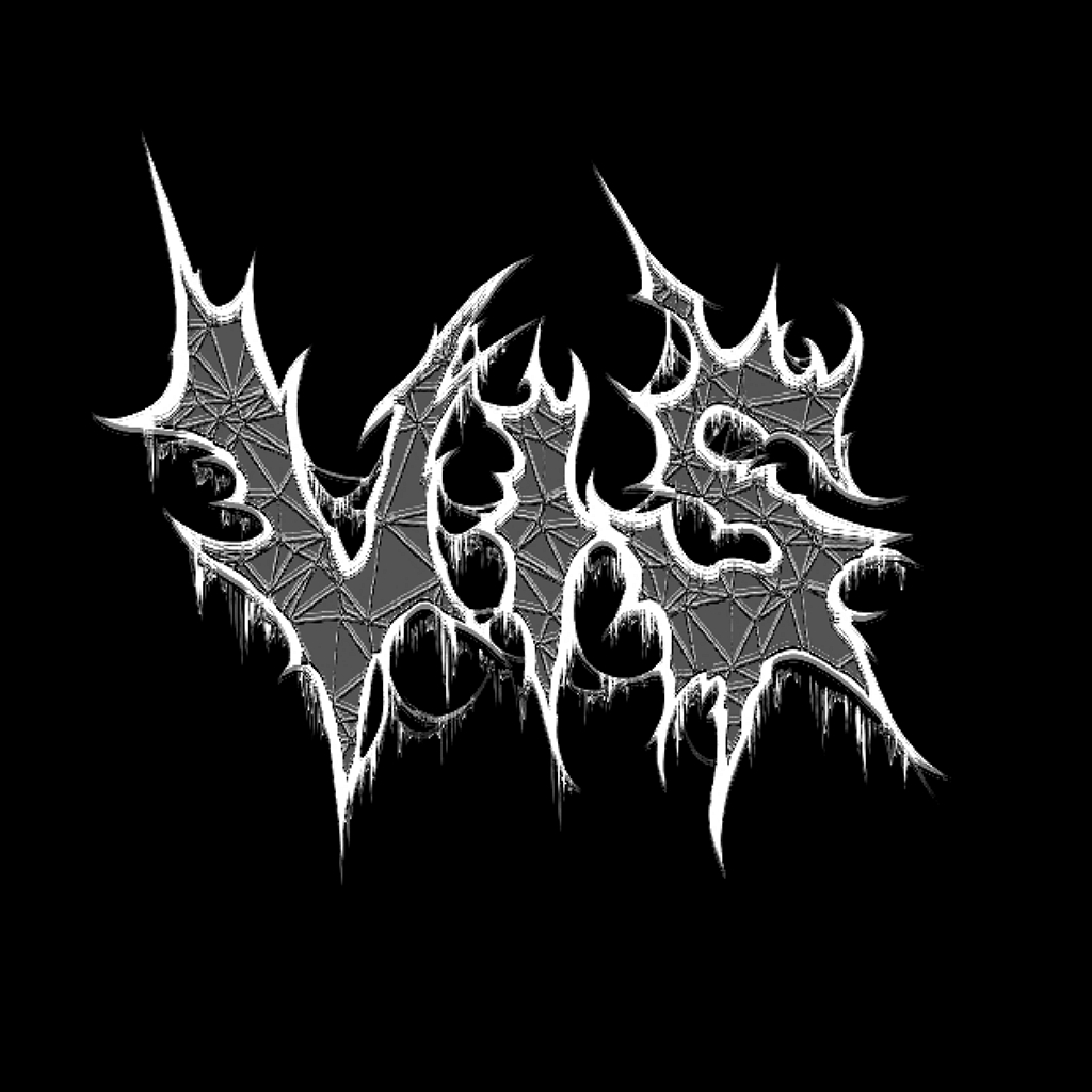
- †hollowed-out Death letters
- †webs and drips
- †polygonal wireframes

- †symmetry
- †interconnected letters
- †an outline or halo
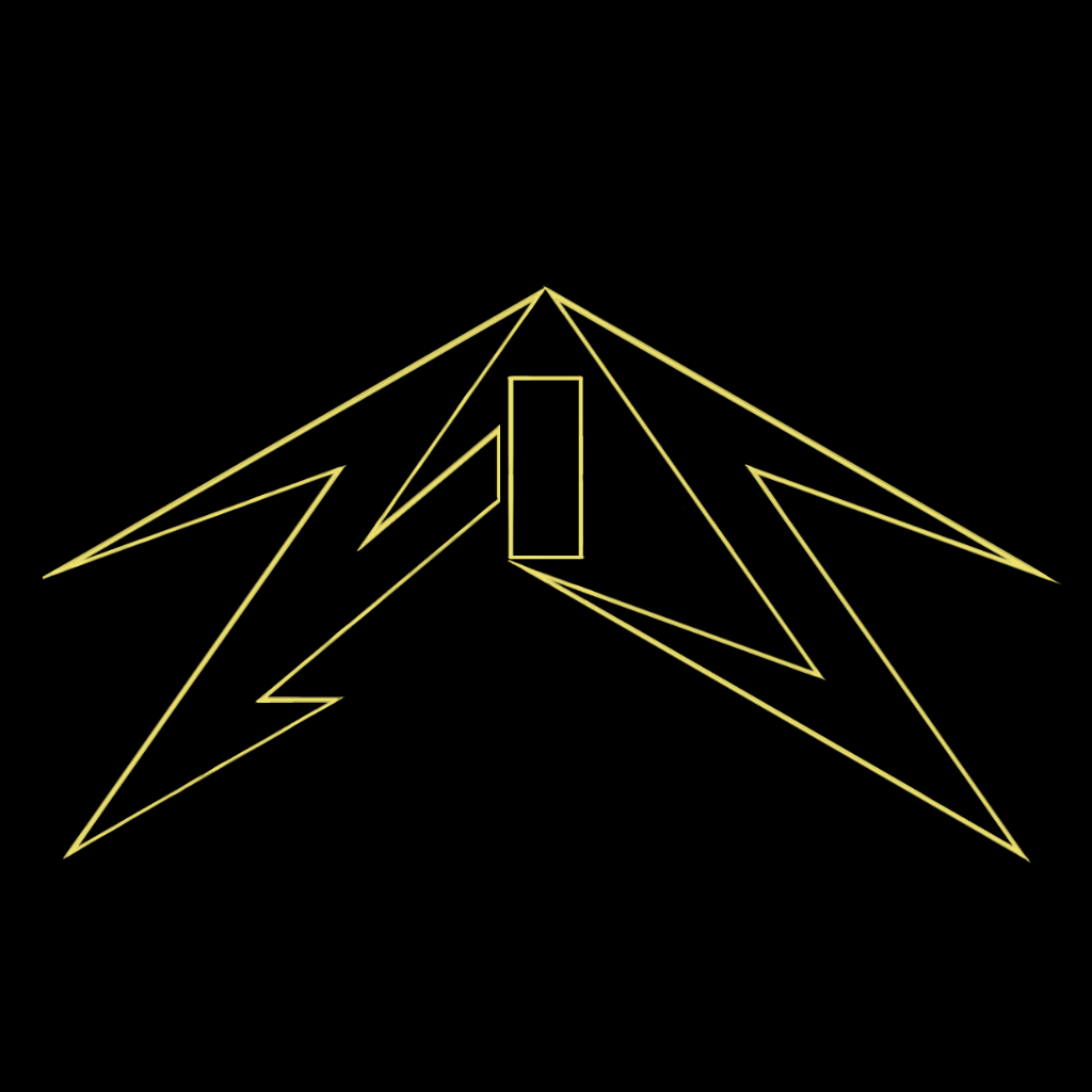
- †straight, sharp edges
- †no softness whatsoever

- †extremely angular, fixed angles
- †less symmetry
- †blocky letters

- †a visual sense of speed
- †cursive, single-line letters
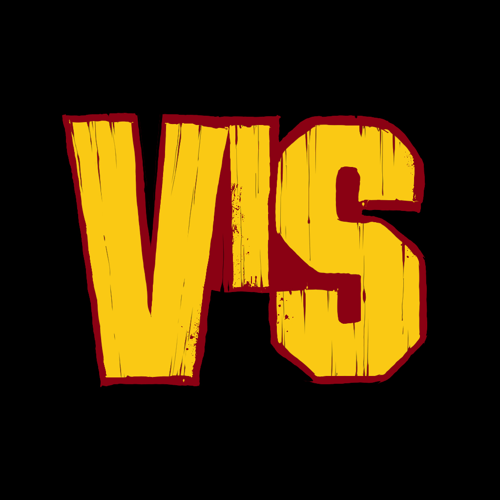
- †a softer logo
- †a wooden finish
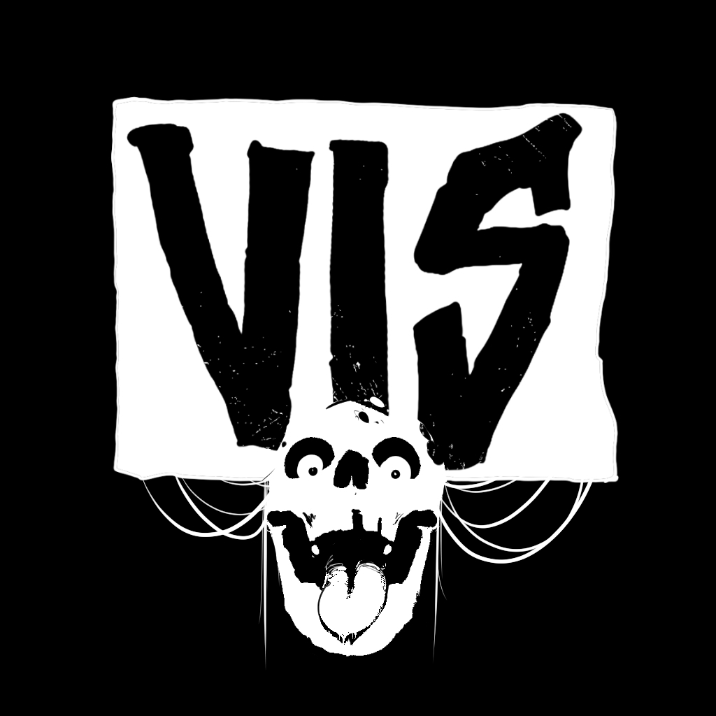
- †a punk logo, with constraints
- †an ironic pictorial image
- †letters spaced miles apart
- †decorative curls
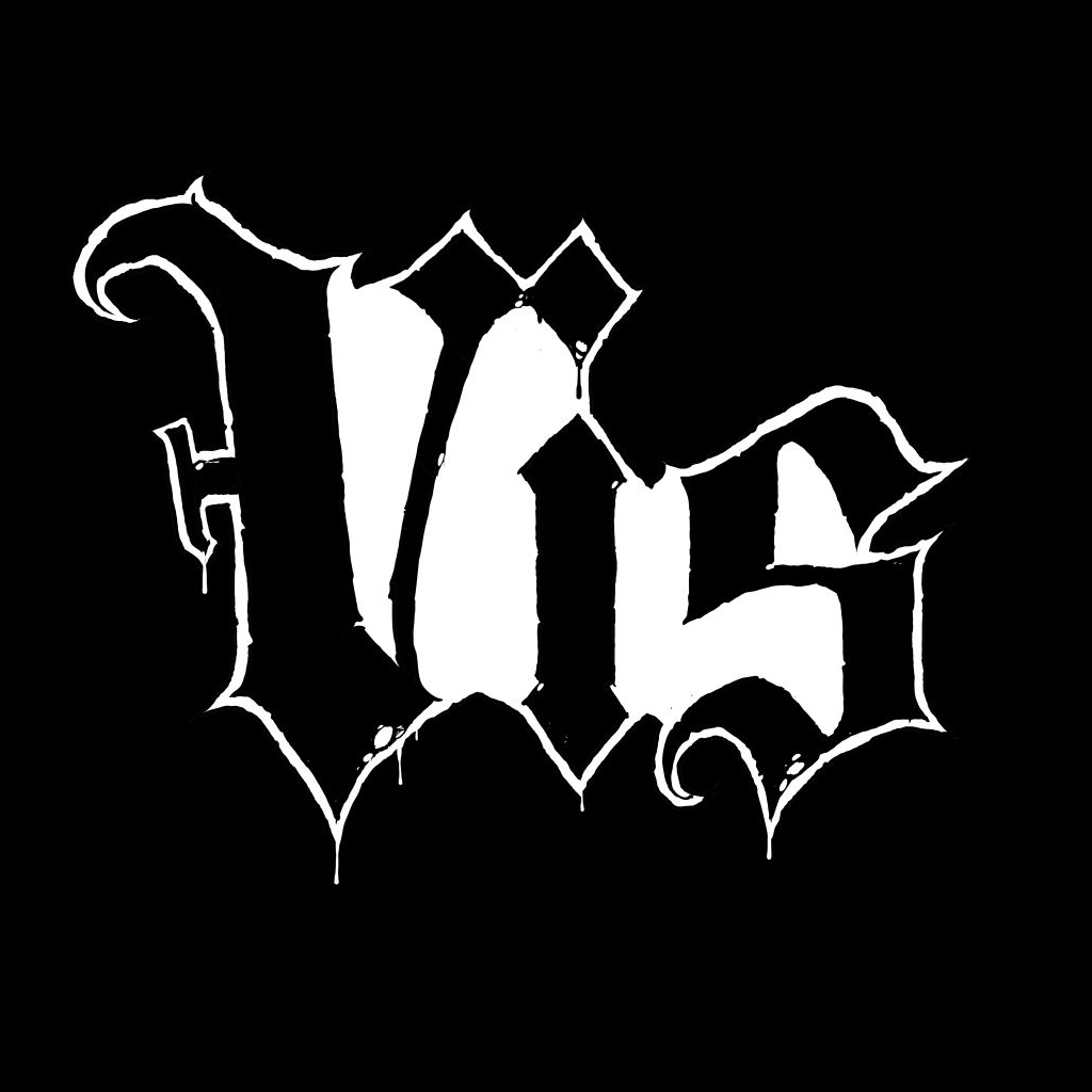
- †blackletter(-like) wordmark
- †a white, jaggy halo

- †deconstructed, minimal Doom
- †repeat … repeat … repeat

- †hand-lettered comics type
- †pseudo-art nouveau
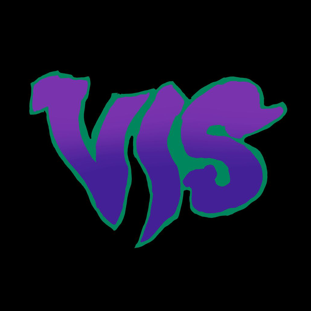
- †hazy, cloud-like letters
- †greens and purples
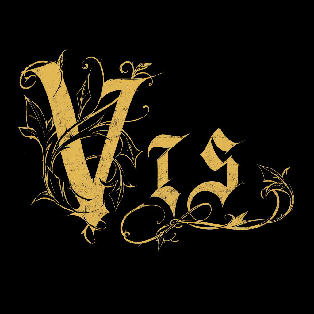
- †blackletter type
- †extra Gothic flourishes

- †biker aesthetics
- †runic motifs

- †biker aesthetics
- †ersatz Fraktur letters
- †rendered in full 3D
- †metallic or stony texture

- †serif wordmark
- †textured gradient fill
- †elongated tails
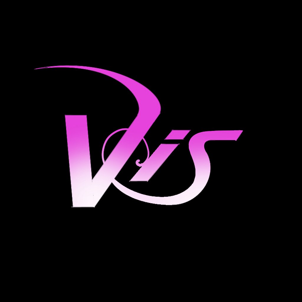
- †girly
- †brightly colored
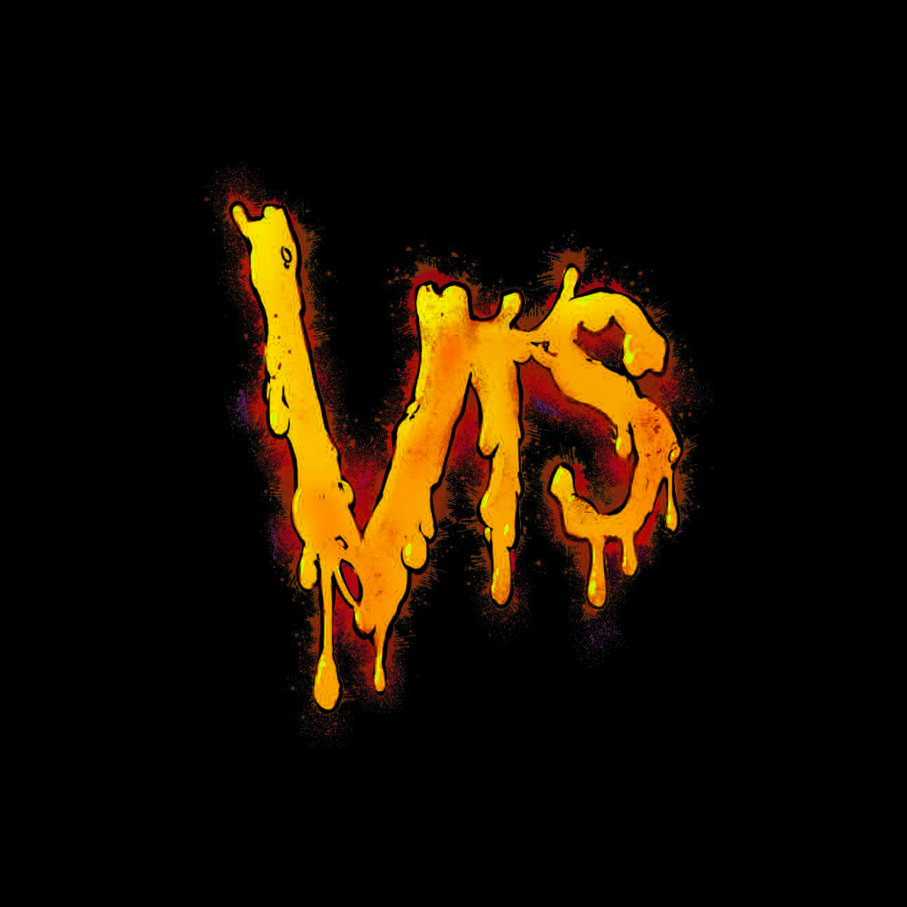
- †crude and unfinished
- †bodily-function references
- †color and texture
- †not safe for work
- †censored here for your sake
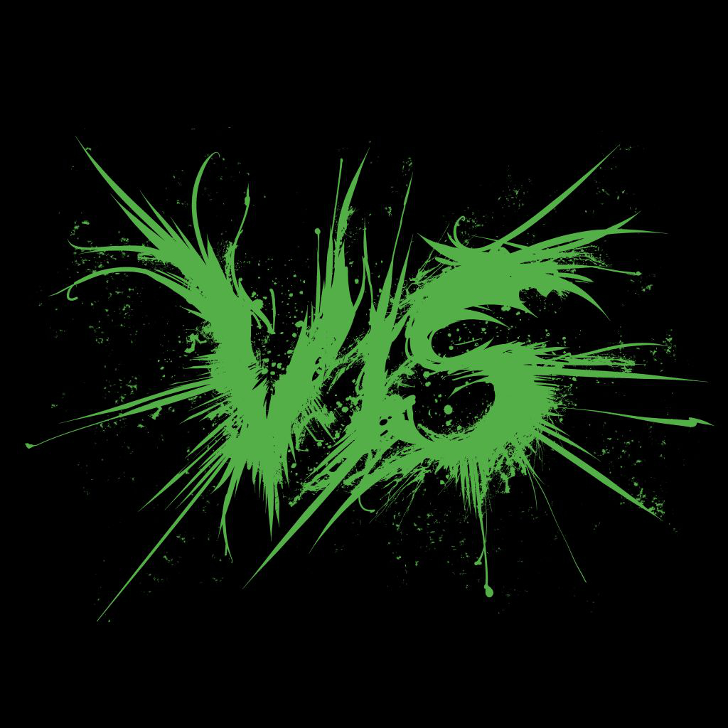
- †stripped-down Death letters
- †splatters and spatters
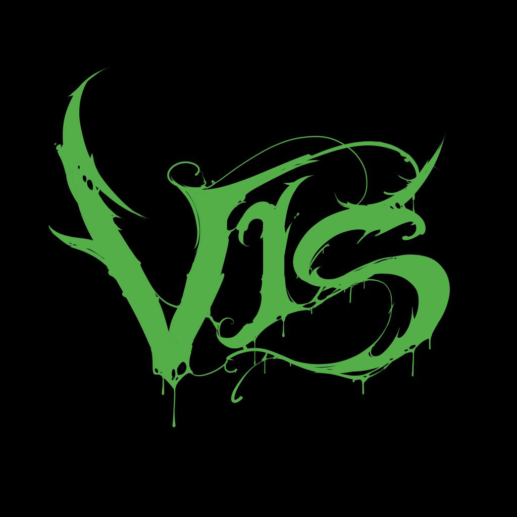
- †stripped-down Death letters
- †splatters and spatters
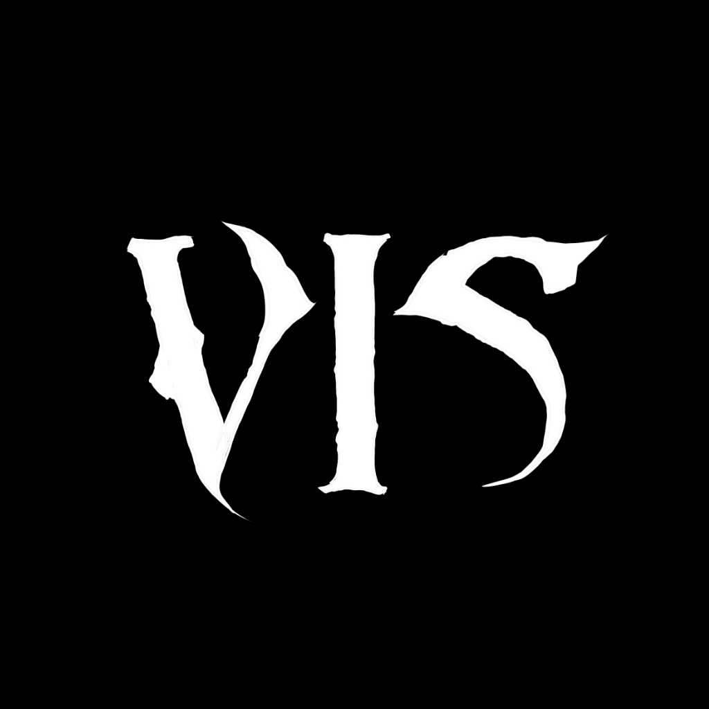
- †plain wordmarks
- †the Abaddon type

- †tight and bold letters
- †missing parts
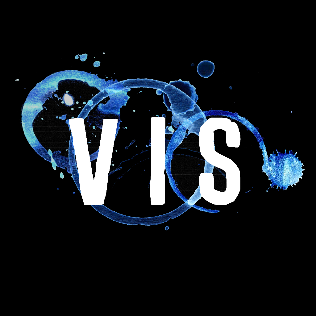
- †coffee stains

- †nothing remotely metal
- †90s cartoon-show lettering
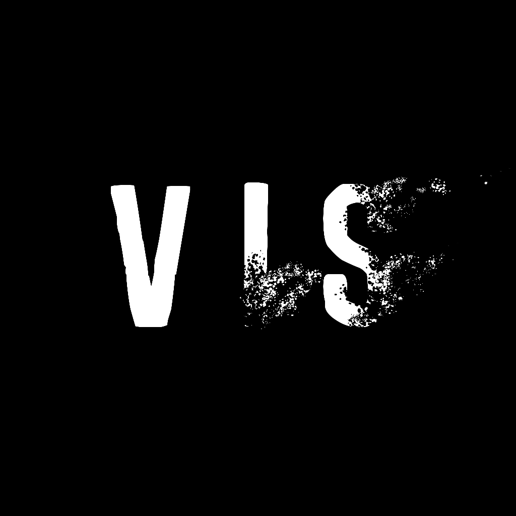
- †dissolving or fading letters
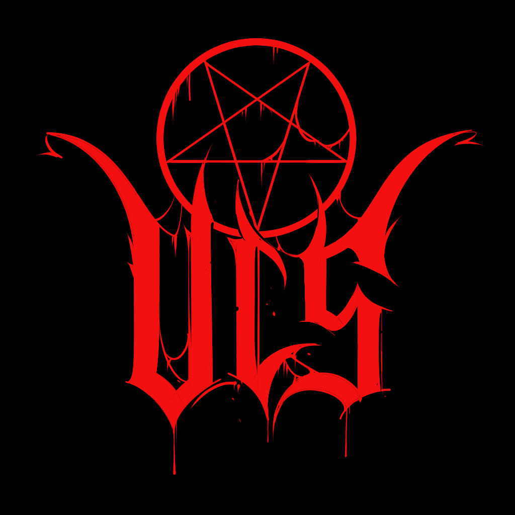
- †a drip
- †a grainy filter
- †an incongruent symbol
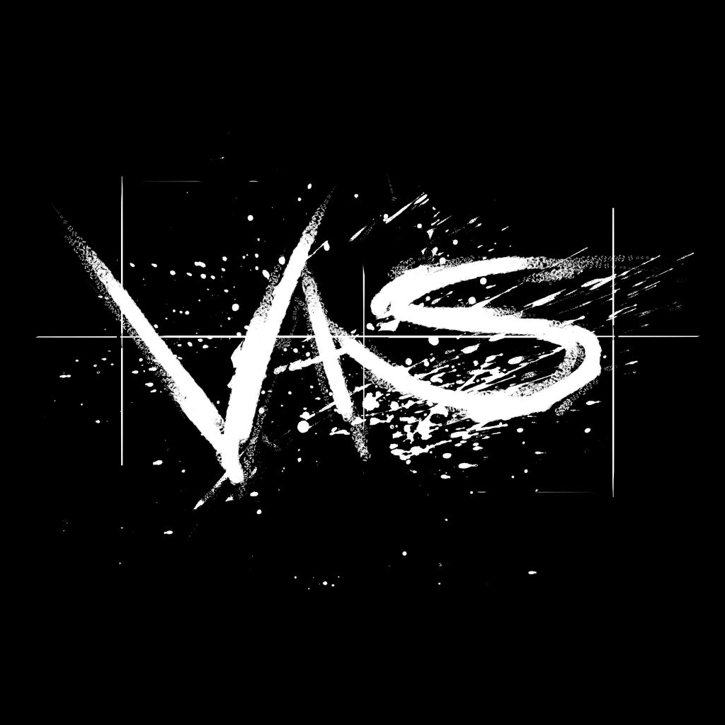
- †preliminary sketches
- †left "as is"
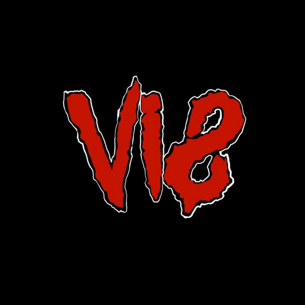
- †puerile design
- †clumsily drawn
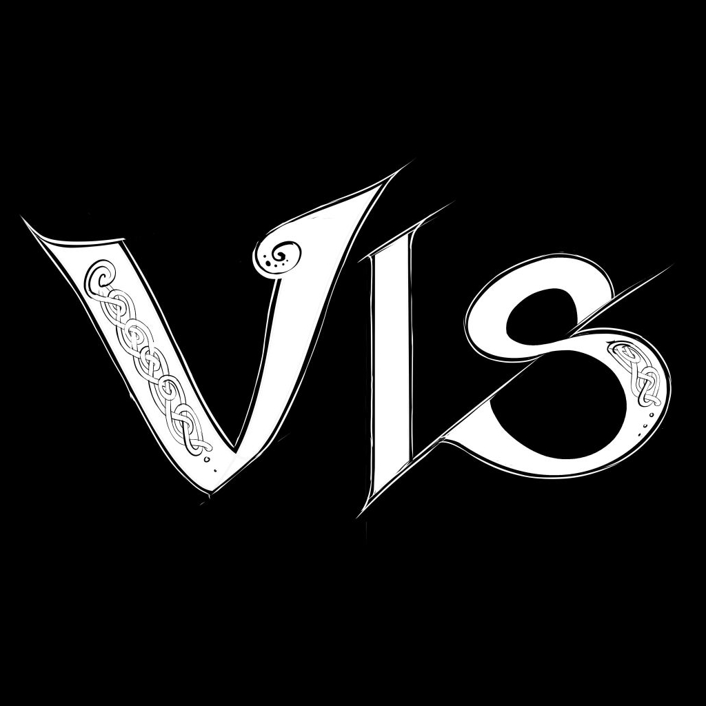
- †lowercase blackletter or Celtic type
- †decorative curls
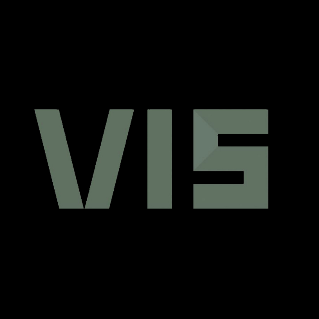
- †lifeless, inorganic letters
- †lettermarks
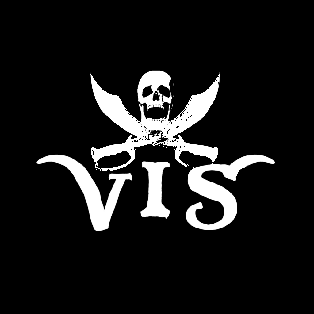
- †skull and crossbones
- †a curved sword
- †kawaii pink
- †bubbly letters
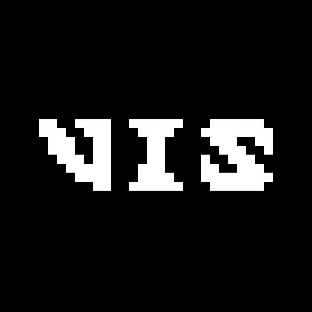
- †an 8-bit font
- †no tweaks needed
Field notes
Fresh notes on every visit“Folk Metal has little to no coolness at all, and this shows in the logos.”
“The letters are spaced miles apart from each other so as to visually convey the sense of mind-numbing slowness.”
“Djent logos are often deluged with ‘coffee stains.’”
The fine print
Full disclosure+
With these genre samples I tried to represent as faithfully as possible a broad range of genres, based on my own years of experience designing Metal logos and studying up on genres I'm not too familiar with. I then had them checked by several scene veterans and a fellow designer to confirm style accuracy and coverage. Some have not yet been officially validated by the “field experts,” but ultimately these remain interpretations anyway.
Maybe you have other ideas about what these logos are supposed to look like, or you don't think my comments are clever, helpful or funny. In that case, drop me a line and tell me what needs improving.
Acknowledgements & references+
A shoutout to everyone who helped me write this guide: your insights and thoughts were much appreciated! Special thanks to three people who shared their time and expertise throughout this project and gave me useful feedback: Erik Negakinu, Marco W., and Melle Gerritsen.
I also did my homework on Metal artists, songs and genres. See the full list of references.