Doom Metal
Doom Metal is the last major mode of Heavy Metal music. For those not in the know, unlike the other (sub)genres, Doom doesn’t really have any unique genre requirements except for this one thing: it has to be ultra-slow.1 If it’s uptempo, it can’t be Doom. But it can be anything else. It’s as simple as that. Just as simple as that. Anyway, the idea behind this tempo thing is to create a sense of doom or despair. (More like, despairing boredom, amirite?)
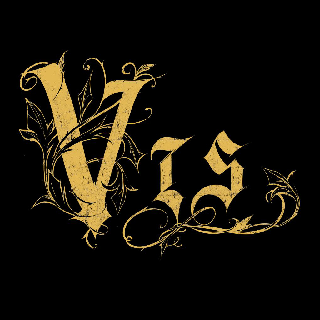
This is what makes Doom logo extremely challenging – challenging for me at least to come up with a genre logo; because it can be so many things depending on a band’s specific interests and themes, and they can range anywhere from a dying bride to … to what exactly? (It’s always about some tragic loss of life, isn’t it?) To put it bluntly, usually it comes down to throwing shit at a wall and hoping something sticks. (But this is just me talking … what do I know? I’ve only worked with a small number of Doom bands.)
Some Doom bands to check out:
- Candlemass
- Pentagram
- Saint Vitus
Funeral Doom
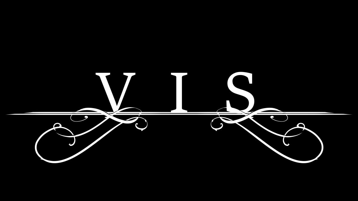
Funeral Doom is characterized by its sloooooow tempos – slow even for Doom standards. The letters are spaced miles apart from each other so as to visually convey the sense of mind-numbing slowness. And because the music doesn’t inspire anyone to come up a cool custom design, Funeral Doom bands often have to settle for a wordmark with some decorative curls that are really only there to signal to the eyes that this or that letter is still very much part of the name and logo.

Some Funeral Doom bands to check out:
- Esoteric
- Funeral
- Thergothon
Related (sub)genres:
Reference(s):
[1] W. Irwin. Black Sabbath and Philosophy: Mastering Reality, p. 79, 2012.
Take me back to the sample overview.


