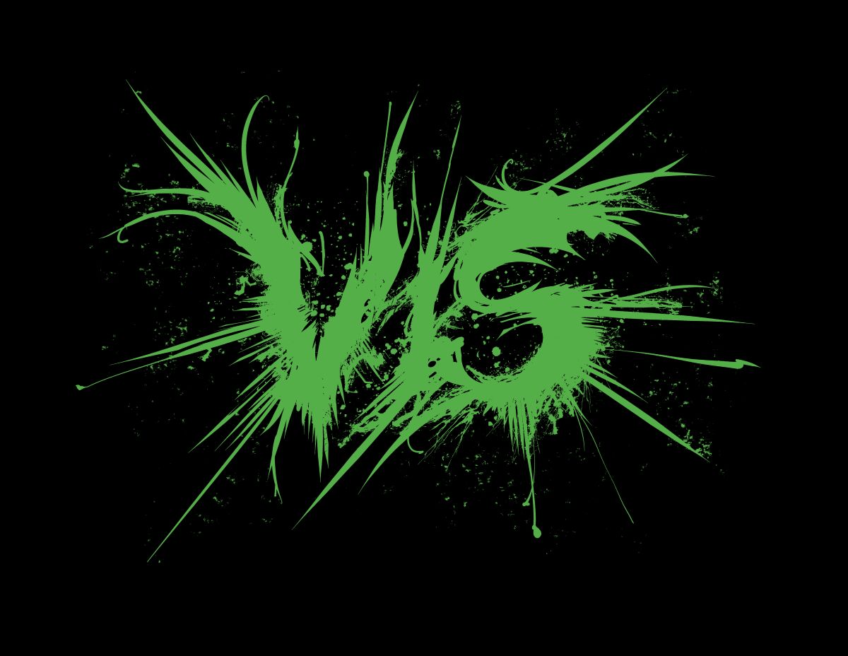
Deathgrind
Deathgrind takes the complexity of Death Metal and fuses it with the intensity, speed, and brevity of grindcore; so therefore it makes sense that Deathgrind logos sit somewhere between Death and Grind logos. More concretely, picture stripped-down, simplistic Death letters that are overlaid with splatters and spatters.
Deathgrind (Continued)
- Person A: “Are they a Black Metal band?”
- Person B: “No, silly. They’re a Deathgrind band.”
If you are anything like Person A, don’t feel bad. It’s is a very common misconception to mistake a Deathgrind logo for a Black Metal logo. But once you know what to look for and how to interpret it, things because as clear as day to you.
For starters, Black Metal logos are typically black and (inverted) white in color; this one is colored green, a color that is often used by Grindcore (and adjacent) bands. (After all, Grindcore is all about doing things differently, and nothing quite says different like green, which, in terms of pigments, is the opposite of red, the choice color of many bands in the Heavy Metal genre at large.) Another key thing to look out for are signs of compositional design – or, perhaps rather, lack thereof. If a logo features a design of intricate, meticulous linework, it’s probably not a Deathgrind logo.
Some Deathgrind bands to check out:
- Aborted
- Carcass
- Cattle Decapitation
Related (sub)genre(s):


Take me back to the sample overview.