Wergild
August 19, 2017
There’s a new black metal band in town called Wergild and I was asked to design a logo for them — which is what I did. Below I’ll break down the process of designing it.
Full disclosure: At the time of writing, I’m not sure if any of the logos seen here will see actual use. But that’s not relevant for this breakdown.
First thing I did was establish a sense of symmetry. Why? Because black metallers usually have a hard-on for symmetrical logos.
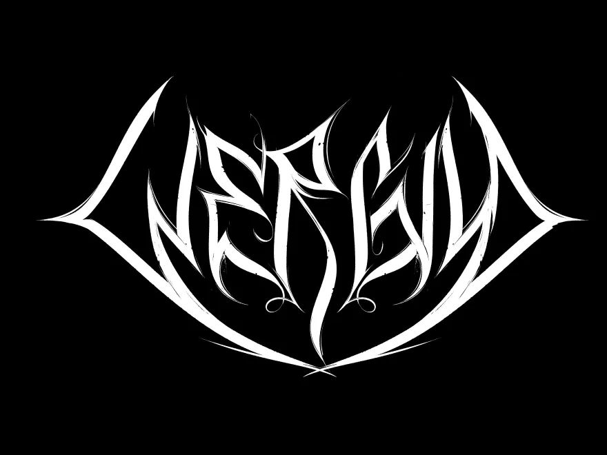
I liked the logo’s silhouette, but something was amiss with the overall shape of the letters. The letter “W” in particular bothered me. As you can see above, it reads more like a “C” or an “N,” so I needed to remedy that.
Also, I decided on making things a bit more jaggy and messy-looking. Generally speaking, this is not a must per se. In fact, plenty of black metal logo designs are neat and tight in design. But one of the band members expressed a preference for something a bit more illegible.
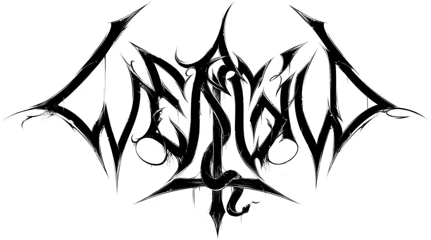
The problem, however, with textured letters is that they don’t look as good when you invert the logo. (The reason, of course, that logos get inverted is because band shirts are usually black.)
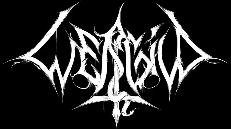
So one simple solution is to simply keep the letters black, placed on a contrasting white background that follows the silhouette of the logo.
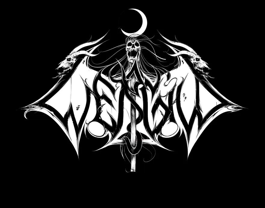
As you can see, I also added some goatheads and a screaming skull because — just because, really. No, that’s not entirely true. It’s part homage to Christophe Spzajdel, the self-proclaimed “Lord of Logos,” whose logo-designs for Horna and Tsjuder have been of inspiration to me, and part conscious design choice to help improve the silhouette.