The Toxocara Redesign: Unused but Not Forgotten
In late 2017 I redesigned the Toxocara logo for funzies. Here’s what I wrote about it:
November 25, 2017
Back in 2004, I was commissioned to design a logo for Toxocara, a Dutch death metal band (see logo below). It was one of the first major gigs I landed — “major” being relative here –, and the band members were enormously appreciative, handing over merchandise with every album release, which is why I hold the band in such high regard, even to this day. The band is now defunct, sadly — although their Facebook page recently showed some activity, so really, who knows?
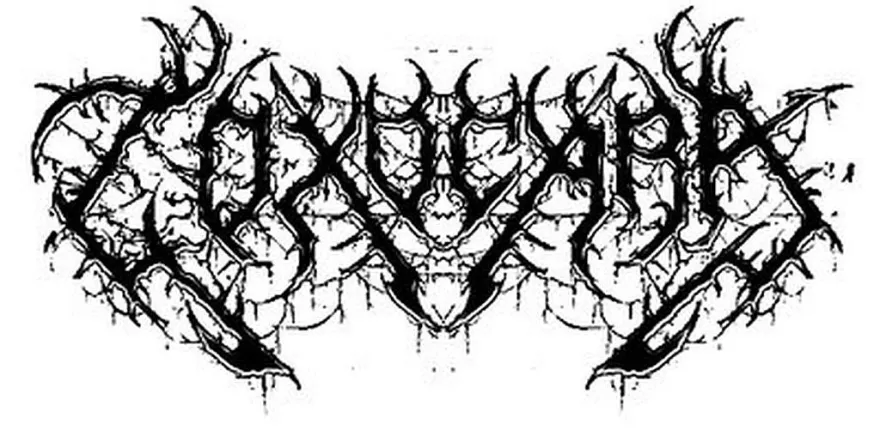
Anyway. The logo was done entirely (save for one minor tweak) in an “old-school” fashion, i.e., with pen and paper, without too much thought behind it. This should be no surprise — it’s why it looks so rough.
Obviously some like it rough. The members of the band — and perhaps especially the driving force behind the band who had part of the logo tattooed on his arm — were clearly happy with how it turned out. Furthermore, an anecdote goes that Christophe Szpajdel, the “Lord of Logos” himself, once complimented the band on it. But me, I always felt I could do better.
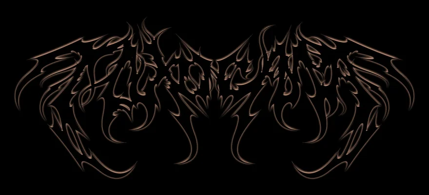
Sadly though, my idea of better was far from what the members of the band thought of as better. Over the years this led to a series of uncommissioned redesigns (see below for an example), some of which were fine logos in their own right, others were blatant misfires. Eventually, I gave up on the idea of ever improving on my original design of the logo.
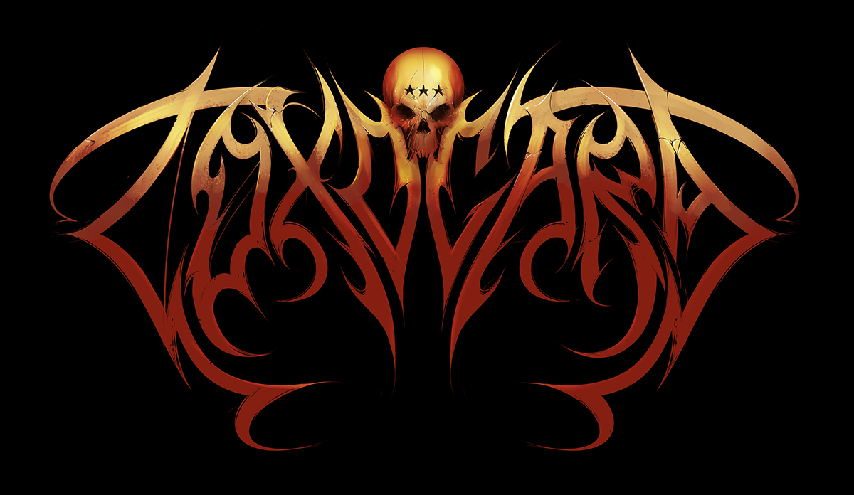
Fast forward to 2017. I’m now busy churning out logos for various projects and purposes; I recently got myself new drawing hardware; Toxocara’s Facebook page showing activity; one of the band’s key members had his birthday yesterday … The time seemed right for one more attempt. And this is what I came up with.