Slave Machinery
June 28, 2017
Today I tried to come up with a thrash metal logo for the first time ever … I’m not quite there yet, but I’m getting there.
I’m thinking the logo could do with a bit less repetition, and its flow needs some improving. If you have any other ideas on how to improve the design, I’m open to suggestions!
Oh, and by the way, for those not in the know – the name’s a reference to a song by Kreator, one of my favorite thrash metal bands.
June 29, 2017
Spent the better part of the day improving my thrash game. Once I’m done, I probably have enough letters to supply the whole thrash scene with brand new, retro-inspired logos.
Kidding aside, I learned a few things in terms of angles of spacing on me while I was drawing and designing these letters. I’ll come back to that when I have more to show you.
July 1, 2017
I’m still obsessed with improving my thrash game. But I’m beginning to get the hang of it. I know now the right angles, and I think I know how to handle the negative space.

Hopefully, sometime this weekend, I get to finish the logo — one of them, and then I’ll write some stuff on how to make one yourself.
July 3, 2017
A few days ago I began on a journey to improve my thrash game. At the time of writing, I was under the impression that I never tried my hands in designing a thrash metal logo. But sometime between then and now, it came to me again that I have actually tried to design one — on two occasions, no less. That is to say, I have been commissioned twice, by two different thrash metal bands, to design a logo. Both times I failed to deliver what was expected of me.
The thing is, at the time, I believed in a one-size-fits-all approach. I had developed my own signature style, and though it was really only suited for black and death metal, I was confident that I could make it work for any band in any genre of music. But I know better now. Now I know that if you want to design a logo for a thrash metal band — well, it’s probably a good idea to design a logo that could pass for a logo a thrash metal band might actually use!
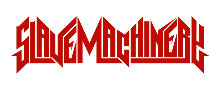
Now, after a few days of practicing, I’m confident that I have the skills necessary to design a proper thrash metal logo. And to prove it, here’s Slave Machinery, v.2!
Alright, so we’ve got a thrash metal logo. What can I say about it?
Well, for starters, I ‘ve always liked the whole idea of a single-tier logo with blocky, angular letters that are — really or seemingly — connected, using a thick line underneath or on top. Not only heightens it the sense of solidity of an already solid typographic core — it also adds a bit of zest to an otherwise perhaps humdrum, type-like logo. Not that there’s anything wrong with that per se — it never held Iron Maiden back from making it big. But then, they have one of the most iconic logos in the “metal mainstream” — or period, for that matter. I’m only saying, think about all the angles, reflect on what you can do to make your logo more interesting or more appropriate to the genre.
When I say you have to think about all the angles, I mean that quite literally. I’ve been looking at a lot of logos of 1980s and retro-inspired thrash metal bands (like, e.g., Dark Angel, Sadus, Toxic Holocaust, Violator), and I found that most are entirely composed of letters with angles instead of curves. It is important to note that this is by no means a hard and fast rule. One of the bigger bands in the thrash genre, Exodus for instance, has a logo with hardly any angled straights to speak of. But all this probably isn’t news to anyone entrenched in the scene. What might be surprising, though, is that you will specifically find a lot of 30-, 40-, and, to a lesser degree, 60-degree letter angles.
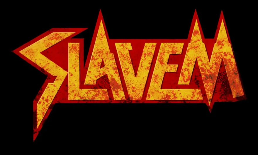
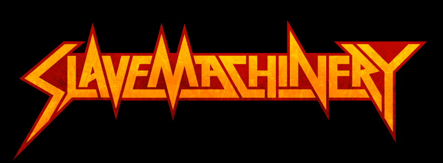
Looking back at my previous version (see below), I feel that I at least got the angles right — but that’s the only thing that’s right. My biggest grip with it is that is too wavy. The constant up and down undermines the solidity that I feel a thrash metal logo needs to have. I also feel that it’s better to have but a few outlying accents extending into to open surrouding space, because an undulating mass doesn’t make for a strong silhouette.
One thing I haven’t talked about yet is negative space. Negative space is the empty space that surrounds an object or, if you will, a positive shape. I once read somewhere that the negative space is what makes people make out letters. I will come back to this later when I discuss black metal logo design, but suffice to say here that when you’re designing a thrash metal logo, you may want to reduce the negative space to a bare minimum, aligning them and squeezing them together — ideally to the point where you can practically only make out the letters by looking at the negative space in the letters themselves. And that’s another problem I see with the logo above. While the spacing between the letters is satisfactorily small — to me, the letters don’t feel boxed in enough.
So those were two of the things that I tried to remedy with the re-design, and hopefully I succeeded. What do you think? Which version do you like best? Let me know in the comments.
July 5, 2017
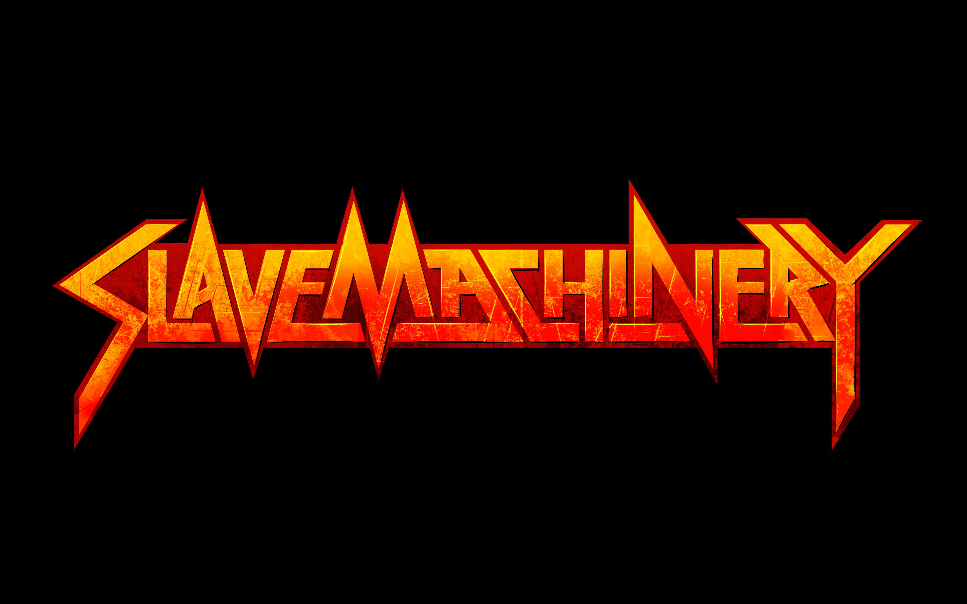
A friend of mine suggested I make some changes to the way the “S” connected to the “L,” and I felt she might be onto something. So I tried it out by giving the “L” a slight portrusion on the bottom. And while I was at it, I also tweaked the outlines a bit and flattened the coloring a bit to make it all more even and balanced.
For comparison — here’s the previous version before all the tweaking.
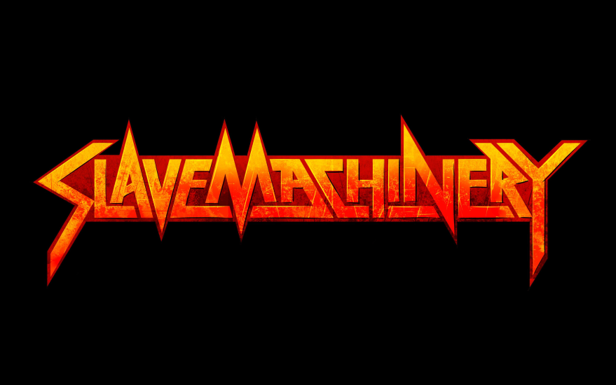
Let me know which version you prefer.