RSH
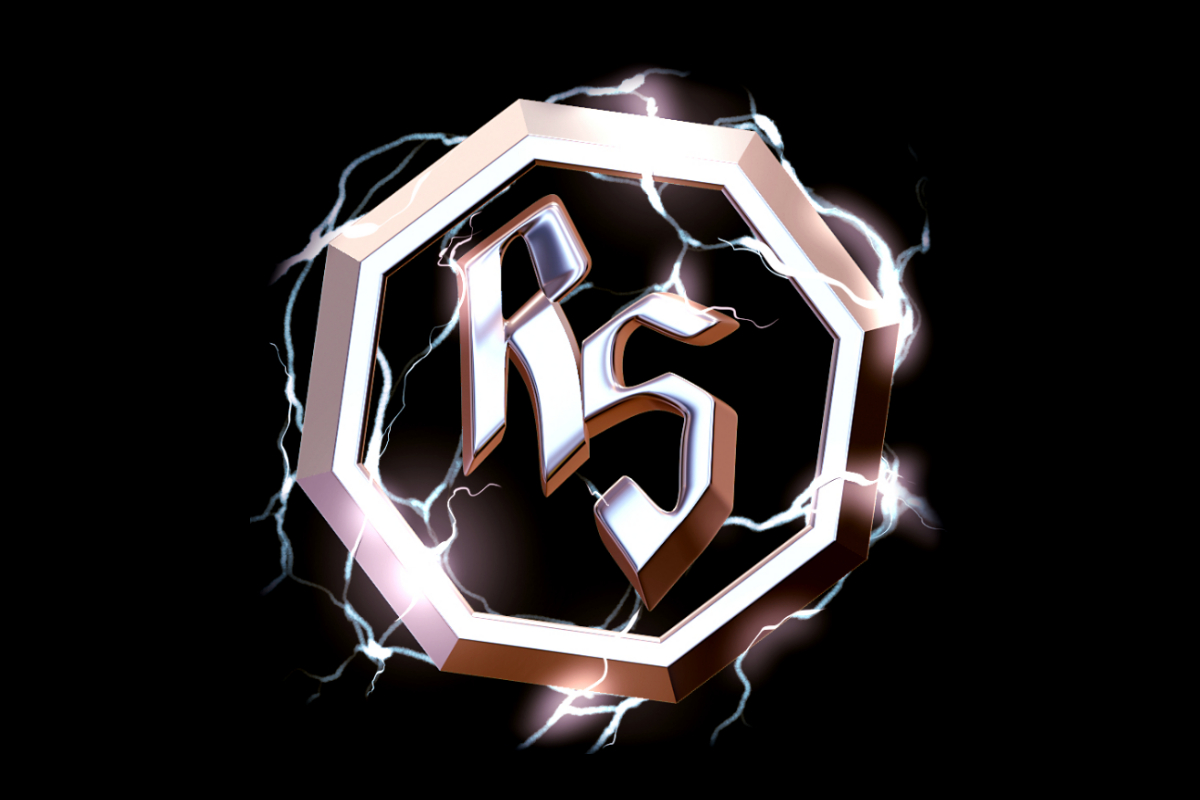
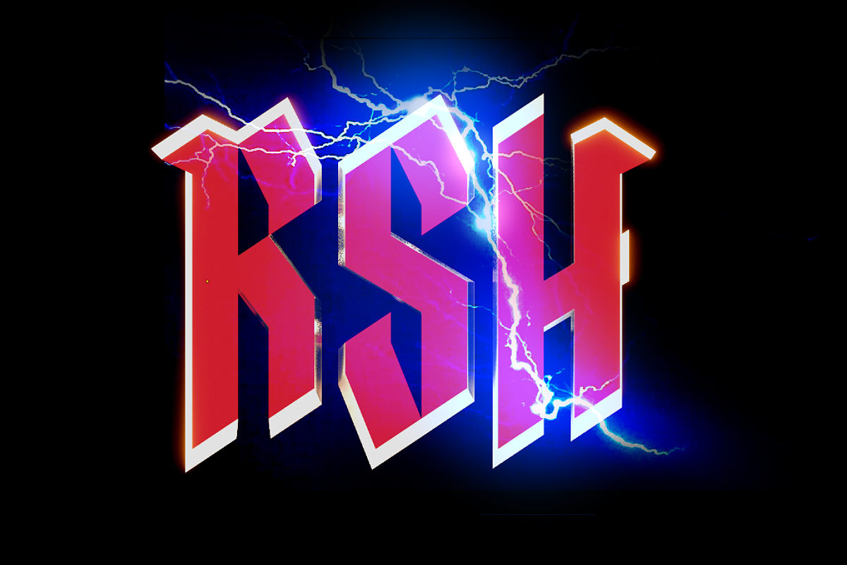
Conceptual Render
Based on a napkin sketch provided by the artist, I did an initial logo concept in Blender.
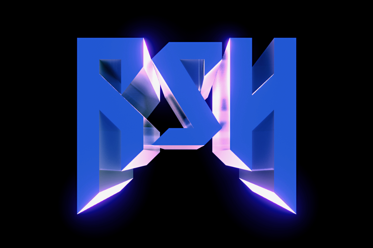
Various Logo Concepts
I then did came up with some new logo concepts.
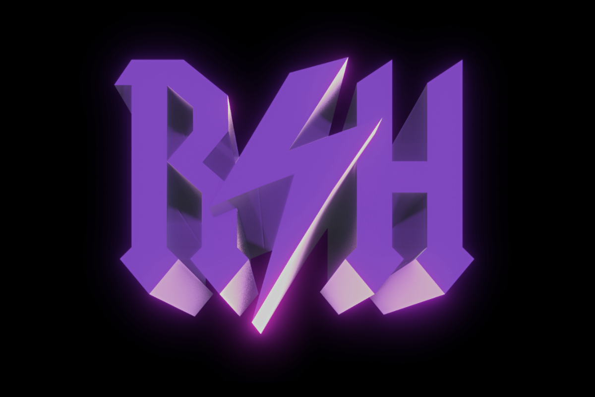
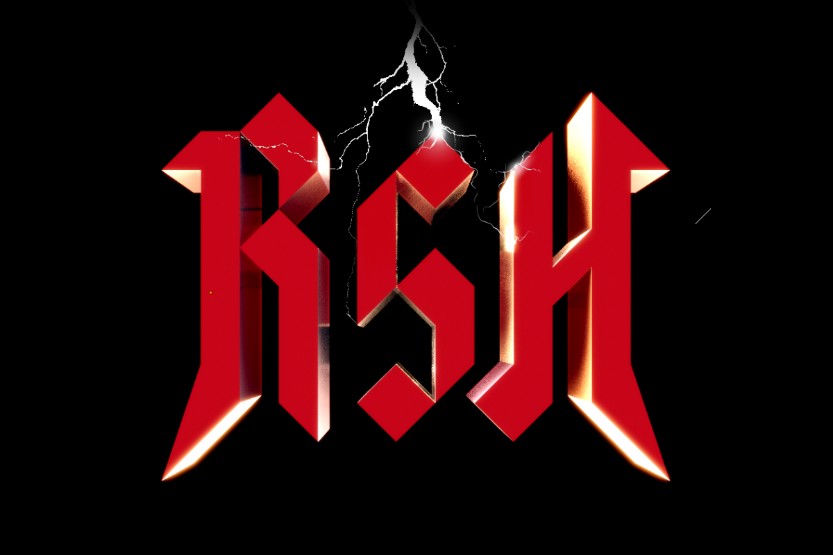
Final Logo Concept
Based on the feedback given to me, I did one last logo concept.
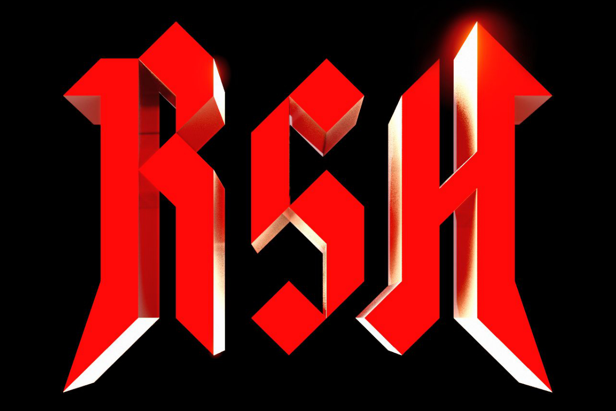
Final Logotype
I then started work on the final – print-friendly – logotype.
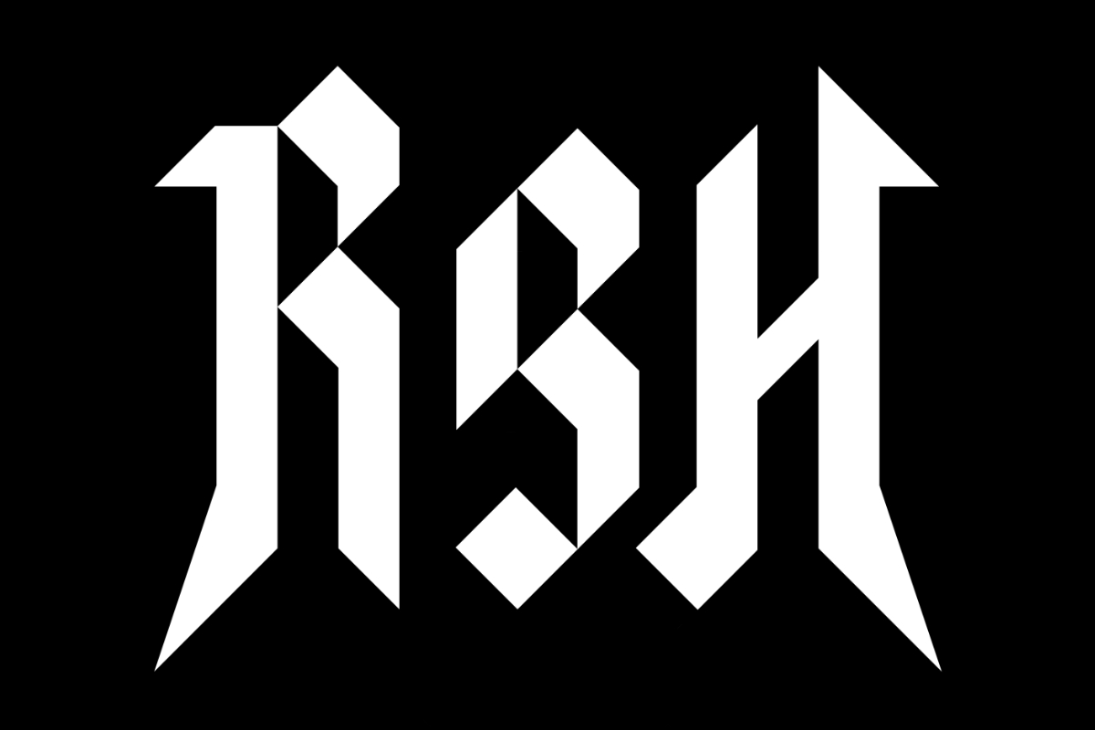
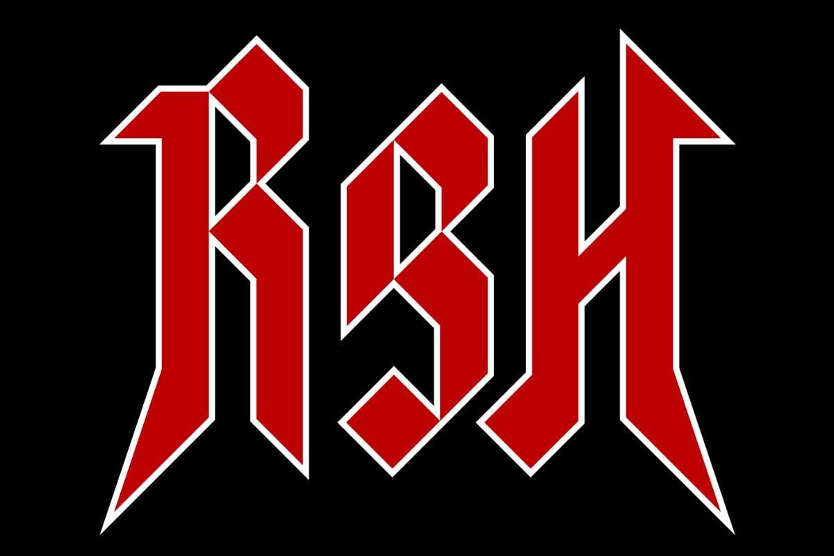
Keyline Version
I added a keyline border to make it even more “clean” and readable.
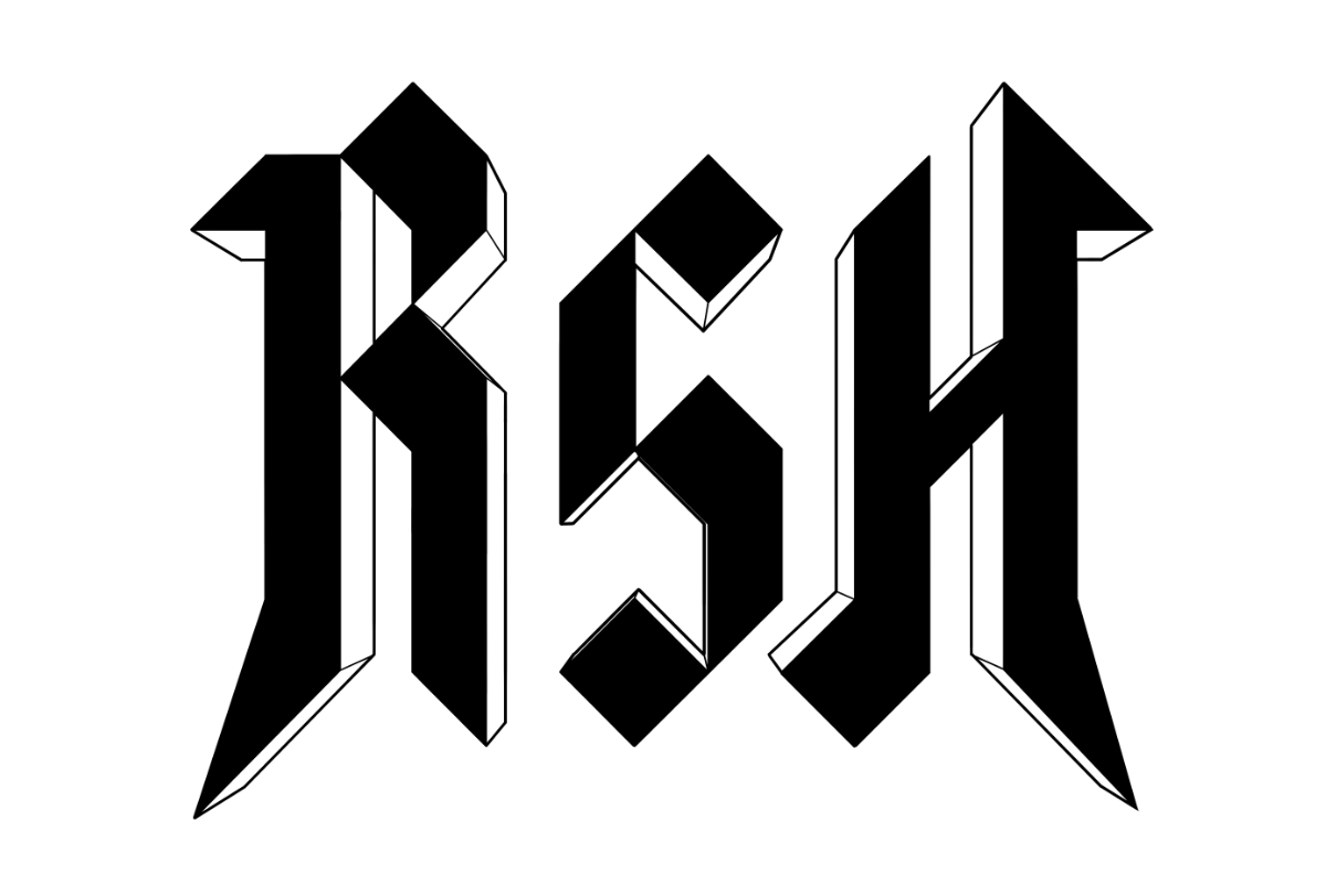
Two-Dimensional Perspective Render
I also wanted to create a print-friendly version that wasn’t so flat. So I rendered the logo in perspective by hand in Clip Studio Paint, using the 3D model as a reference.
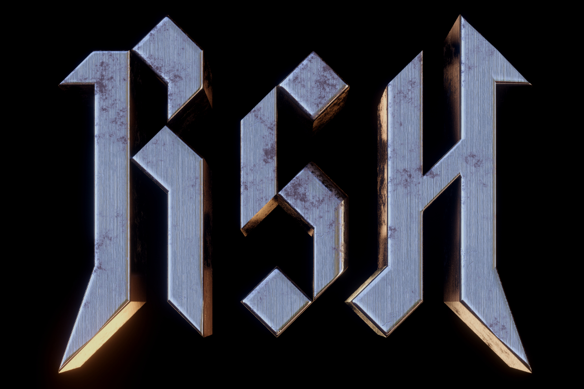
Definitive Version
For this final version, I went back to Blender. I wrote a custom shader to give the logo a weathered metallic look.