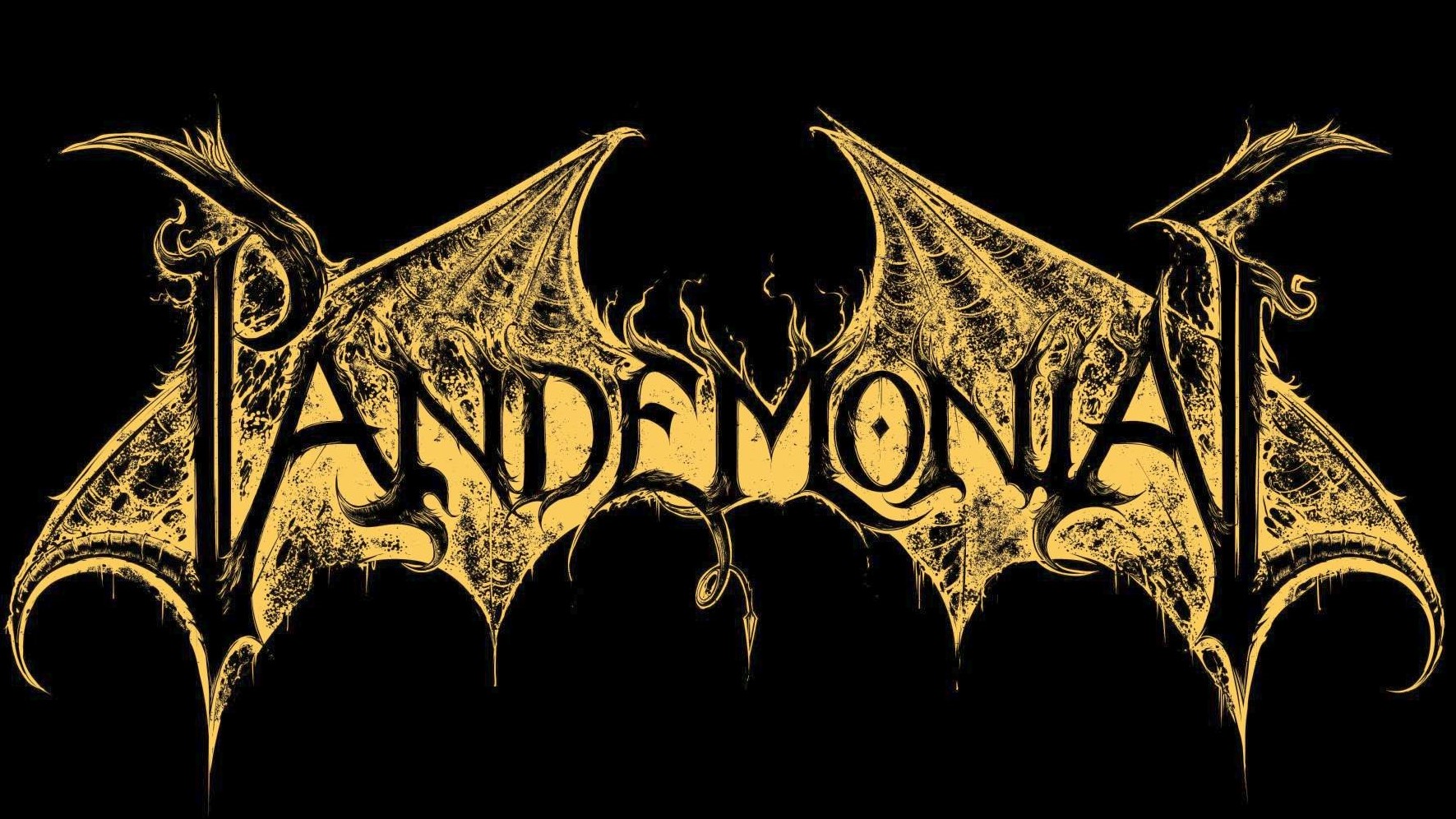
Pandemonial: Stick a Fork In It
This one just got the seal of approval.
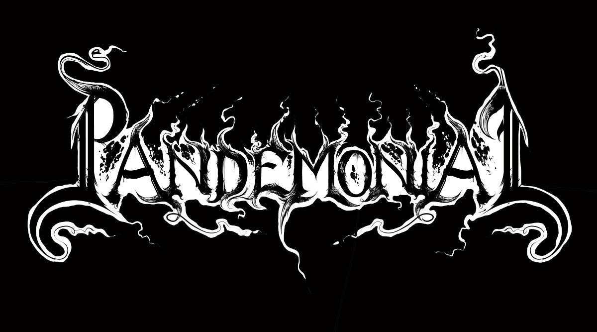
Yeah, things sure look different from my initial sketch(es).
The artist behind the band, whom I’ve worked with before, felt that it was a bit too similar to the other logos I did for him. This time around he wanted something a bit more old school, say in the vein of the (old) Beherit logo. (I’m not sure who designed it. I want to say Chris Moyen but I could be wrong.)
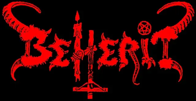
So I came up with this: it’s a bit more subdued than Beherit’s logo, but the inspiration shines through.
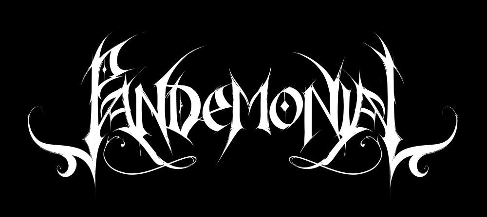
The artist liked the design, though he had some suggestions for improvement. So I made some tweaks to it, which yielded the result below.
I thought it looked too pristine, however, so I added a flamy halo around the letters and some rotten bat wings too for good measure, and the result is what you see above.