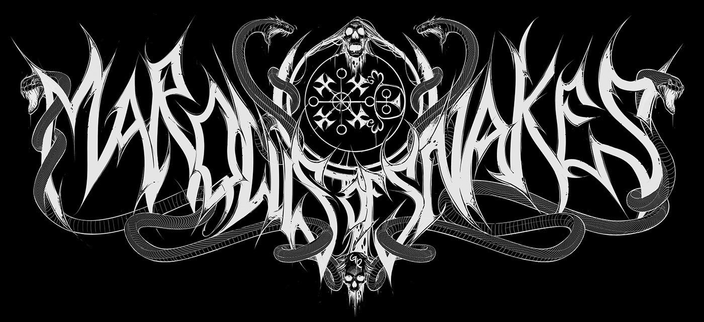
Marquis of Snakes
June 26, 2017
I was thinking of following up on my previous entry, explaining what I set out to with my latest cartoon. Instead, I decided on writing an update on what I’ve been doing lately.
So what have I been up to? Well, I’m back to designing band art. Now, I can’t share everything — you know how it is, what with some bands wanting to reveal their logo or album cover in a special manner. But there’s stuff I can show you! Take this Marquis of Snakes logo, for example.
On Twitter I jokingly remarked that I like my metal as I like my stilettos — black and pointy, much like a logo. The joke fell flat. (That’s Twitter for you!) But there is a truth to it. As much as I like soft, soothing music, I also like sharp and pointy black metal. Now, while I’m not as deeply entrenched in the black metal underground as I used to be — ever since I moved to Bergen, Norway, I find myself increasingly drawn to black metal again — which is also why, of course, I’m going to Beyond the Gates this August. What has any of this to do with the logo above?
Well, I’ve been wanting to design a real, proper black metal logo for some time now — especially now that I live in a Norwegian town that is, basically, the capital of the black metal scene. You see, over the years, I’ve designed mostly death metal logos, and what few times I designed a black metal logo — it was probably a parody logo (see the Hivernatum logo below), so I’ve been lacking a good black metal piece for my portfolio. But that’s about to change. The Marquis of Snakes logo is going to be one hell of a logo — and I’m going to have it printed on a shirt so I can wear it to Beyond the Gates! I’ll be my own walking advertisement, and it will be great!
So there’s that, but there’s more to the story. For instance, why Marquis of Snakes? I remember watching The Conjuring 2, the slightly disappointing sequel to — well, The Conjuring, and the only thing that really stuck out to me was the name of the film’s main antagonist — Valak, a demon whose title is — that’s right, you guessed it! — Marquis of Snakes. I figured I could turn it into a logo that genuinely screams “black metal,” and some initial sketching proved it a viable idea (see below).
A few hours later I finished the lettering. And now — well, now I’m thinking of adding some more graphics to it, in order to take it to the next level. I’m not talking here of some goatheads or a winged Baphomet, or any other stuff that bear no congruence to the name and what it implies — no, I’m thinking snakes, a fallen cherub, or something like that. Whatever. Anyway, the logo should — probably, or at least hopefully — be finished sometime later this week. So stay tuned — because I’m sure it’ll be a lot more fun to look at it than watching The Conjuring 2 in its entirety!
November 2, 2017
Remember this Marquis of Snakes-logo I posted a few months ago?
Well, anyway, I was never really happy with how the letters turned out. So I decided to re-do them — from scratch. At the time of writing, I’m about half-way done (see below) — and it shows an improvement over the original lettering.
Last time, I didn’t get around to adding all the graphics that I originally intended to add. This time however, I already went ahead with sketching the demon in the back of the logo (see below).
I’m really looking forward to finishing this logo. And if you’re excited as I am to seeing this one finished — then stay tuned for future updates!
Then somehow I ended up with this in early 2018.


