Industrial Metal
As the name suggests, Industrial Metal fuses Heavy Metal and Industrial music, which in itself is a fusion of Rock and Electronic music. But it needs saying that “Industrial” is mostly used as an adjectival descriptor – as in “Industrial Black Metal,” for example.
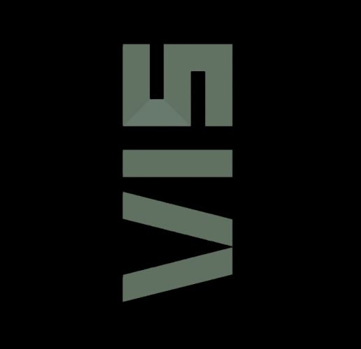
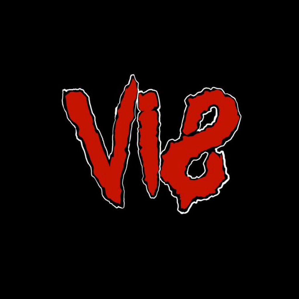
This is all very interesting, of course; but what it means for anyone interested in metal logos is that in this genre bands’ logos typically have a mechanical look to them. When I say “mechanical,” I mean that alone – “lifeless, inorganic” letters (i.e. sharp-edged, blocky, perfectly spaced) that are sometimes tilted 90° degrees to the left from the horizontal. Furthermore, these logos are sometimes lettermarks featuring only bands’ initials – usually in a unique typesetting. (But this is difficult to illustrate with a name like VIS.)

Some Industrial Metal bands to check out:
- Aboryrm
- Deathstars
- Nine Inch Nails
Related (sub)genre(s):
Take me back to the sample overview.
