Exploring the Design Space of Metal Logos
Take me straight to: Background | Results | What’s Next? | Conclusion
Introduction
Metal logos can be by turns gaudy, uncouth, or nearly illegible. Yet, these logos work: they communicate sophisticated notions of genre and emotional effect. Now if you’re a metalhead, you already know that. But it has never been investiged scientifically that Metal logos actually tell a story – even if it’s not always immediately apparent. Well, not until now, that is.
Background
We, a group of international researchers and myself, worked on a paper on Metal logo design that was submitted to and accepted by the alt.VIS workshop at IEEE VIS, the premier forum for Visualization and Visual Analytics research.
On Sunday October the 24th of 2021, we presented our work to the Visualization community, and the feedback we have received from its members has been overwhelmingly positive.
Results
What we did, and why did it, is best explained in the paper, but the short of it is that –
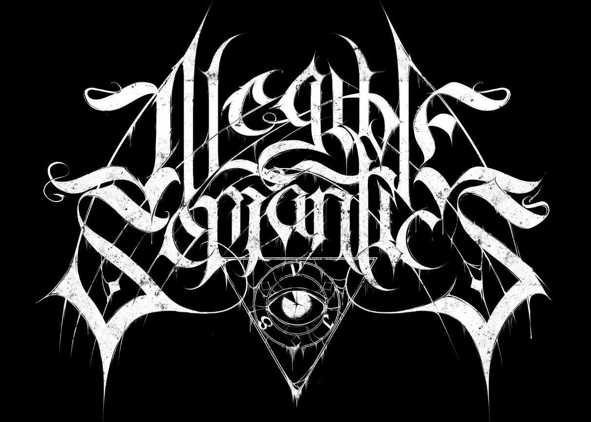
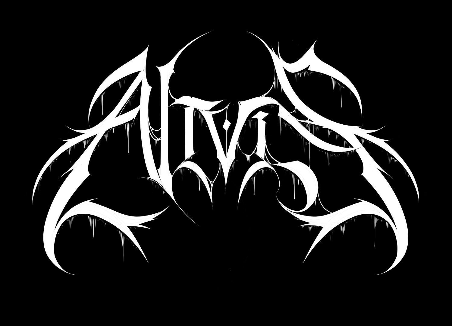
- we worked on a framework, which we dubbed the “Dimensions of Doom,” to help characterize “illegible” band logos. To test and further develop this, I created almost 50 logos of the same word (VIS) in various genre-representative styles.
- we developed a web tool that is based on machine learning that (1) allows the user to explore a “cloud” of thousands of existing band logos that were scraped from Encyclopaedia Metallum and (2) group them based on certain characteristics such as genre, color, and “image-likenes.”
The main result of the paper is that we can now say that there is definitely more to designing Metal logos than just making them as unreadable as possible; that there is indeed a visual language in the logos, which may have implications for visualization research topics.
But don’t believe us; see for yourself! The paper’s available open access; you download a PDF version here.
Its website companion, which contains a link to the MetalVis web tool and a tutorial on how to use it, can be can be found here.
What’s Next?
In the future, we plan to continue working to both extend, refine, and unify our parallel approaches. Doing this should help us get a better understanding of how visual style creates meaning in band logos.
To this end, additional interactive features and filter options will be added to the web tool (such as geography or our Dimensions of Doom). The Dimensions of Doom, too, are a work in progress and not a gospel that can’t be changed. In fact, we already have some ideas for future changes and improvements.
Conclusion
We see a potential that reaches beyond logo design and the Metal industry at large. Further work may indeed well lead to an expanding knowledge of visual rhetoric and its history.
Based on our preliminary study, we may already cautiously suggest that literal legibility – that is legibility understood in terms of clarity and efficiency – is not the be-all-end-all of textual information visualization, contrary to what common wisdom says on the matter.