Chorus of Torments: Behind the Design
Basic black never goes out of style. It’s as true for metal logos as it is for fashion.
October 30, 2017
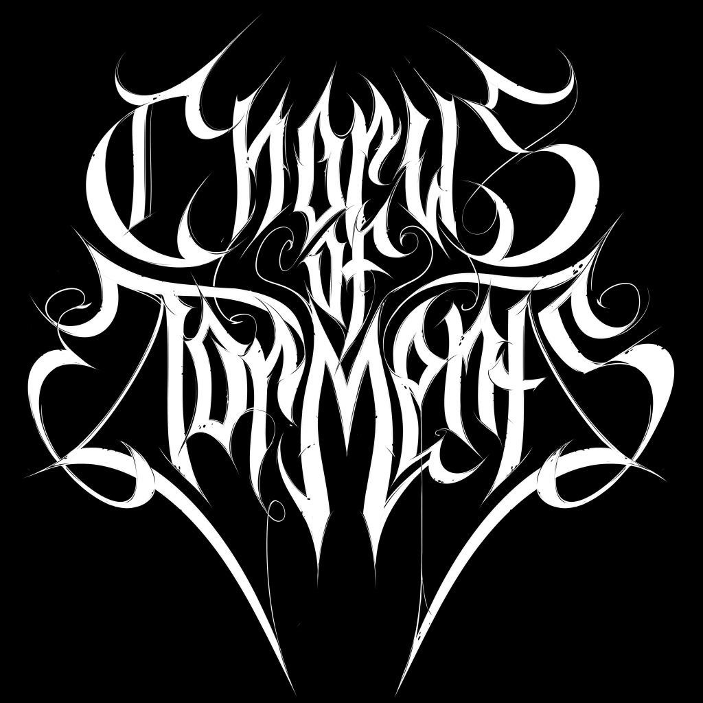
Last night I finished designing this logo here. I don’t really have anything to tell about it, other than it’s portfolio piece. I just felt I needed another strong black metal logo before trying my hands on a new genre.
As for the name, Chorus of Torments, I remember coming across it in some book, I don’t know which one, and I figured it would make for a cool name for a band, real or imaginery. And I sketched something out on a piece of paper, which yielded the following result:
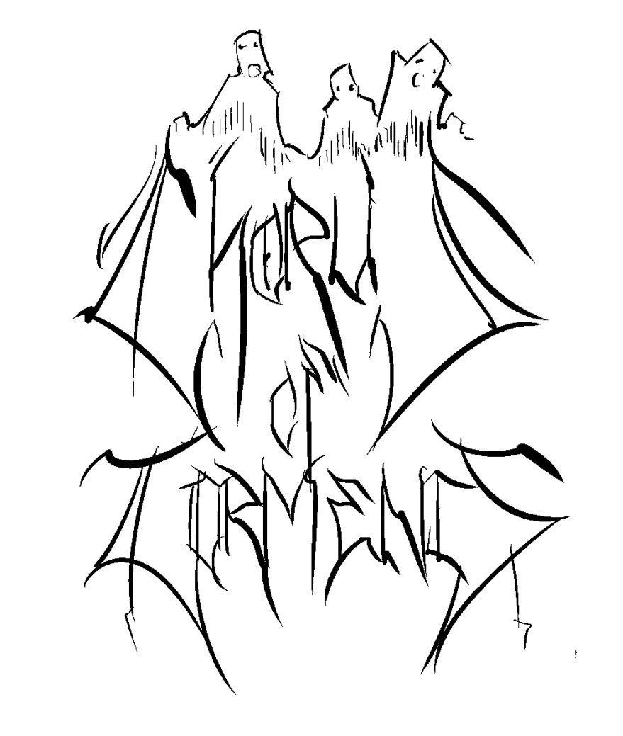
As you can see, I made some changes to the original design, hopefully for the better. The biggest change was the omission of the figures on top of the logo. Personally, I thought it would be nice to have an image of people suffering complement the logo (see the sketch below) …
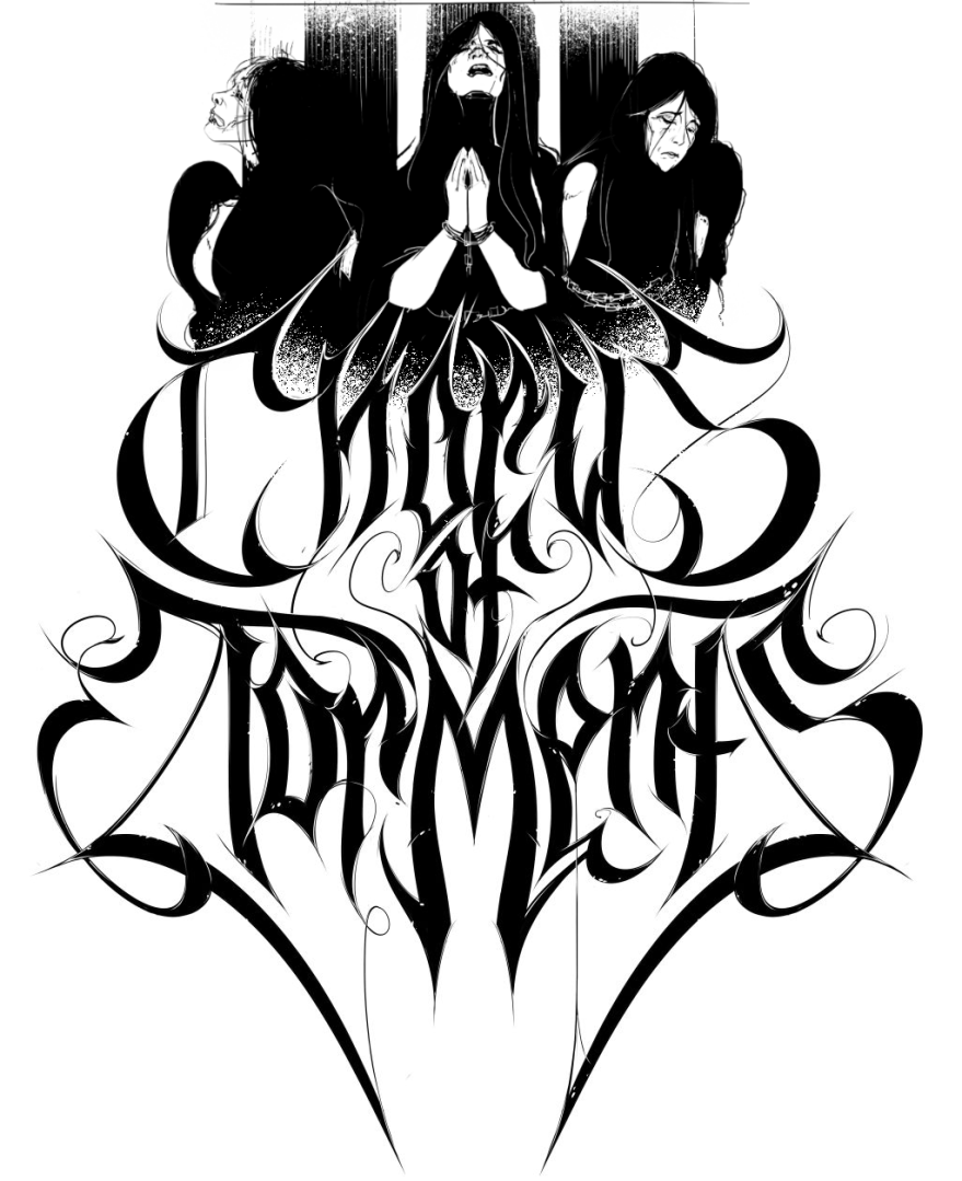
But some people whose judgment I respect advised me to omit it because they felt it be too on the nose and harm the readability and printability of the design. Right now I’m inclined to agree.