Bay Area Thrash
If we are to distinguish further among US Thrash Metal bands and we continue differentiating, then the early-1980s San Francisco Bay Area scene surely deserves some attention from everyone! What’s interesting here is that the aesthetics of said scene were largely characterized by a “do-it-yourself” ethos, as opposed to the aesthetics of the then already established Metal bands who often used established fonts for their logos (see Iron Maiden, for example).1 Arguably the most famous example of this is Metallica’s logo that was drawn up by none other than James Hetfield himself. This may be why certain US Thrash logos, or part of these logos, look a bit off; because they were not always done by trained graphic designers who are familiar with rulers and with drawing and measuring segments.
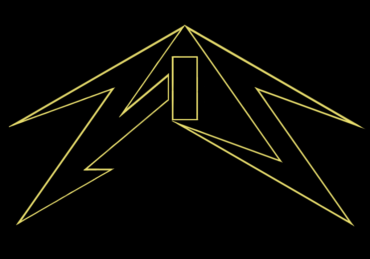
Another thing to point out here is that in Bay Area Thrash logos you can often find a juxtaposition of straight lines with round shapes or straight lines against curved lines. To refer back to the example of Metallica’s logo, the C is rounded, but the first and last letters are sharp and italicized.
Some Bay Area Thrash bands to check out:
- Death Angel
- Exodus
- Testament
Related (sub)genre(s):

Take me back to the sample overview.